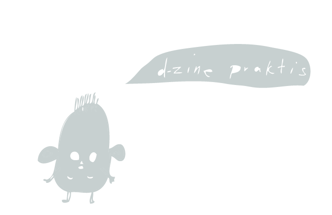
I am working on some ideas for my own brand identity for my portfolio.
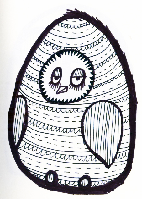
This first idea comes from an idea I had for my packaging for the top ten brief. I thought this spiky circle worked really well to frame the words as a more interesting alternative to a plain circle. I want to use this typeface called 'Lobster' that I used to base my 'real life' typeface on for the 'type as image' part of the image module. I love the ligatures that are possible with this typeface. At present it is unaltered, but I will be sure to edit it later on...
IDEA 1
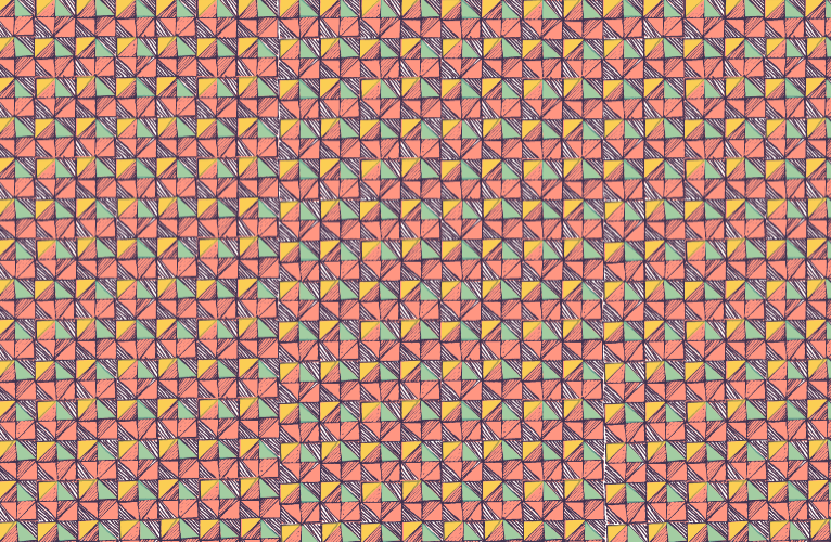
Colour palette experimentation :
reminds me of mint chocolate chip....
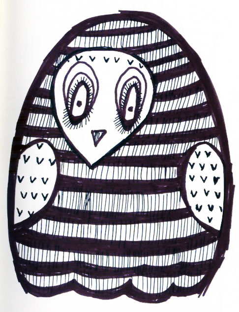
IDEA 2
I tried reversing the spikes which I actually think works really well if not better. I think it works especially well on a flat white background while the previous design jumps off of the background.
IDEA 3
I used some decoration that I created as part of one of the image module briefs but decided against using for my final submission. I wanted to have a go at creating a more decorative feminine logo.
Colour experimentation :
I feel that the circle is too hard around the edges. The pattern doesnt really merge that well with the circle. I want it to look like it's one object. I think that the more muted, paler colours work better at the moment for the reason that they are less intense against a white background.
Here I have inserted more anchor points and tried to curve the circle to the shapes of the swirls.
I did half but I really dont think it works any better..... I think I need to look at it with fresh eyes later or tomorrow its driving me nuts.
IDEA 4
This is just a quick experiment with a plain circle and cropping the words slightly...
I think that the simplicity of the circle is nice and clean but doesn't really reflect my style as a designer very well.
Text layout experiments....
At this moment in time, I think that this logo is the most successful. I wanted to experiment with the text layout as I have so far only tried a couple of solutions.
I don't think any of them work as well as the top two. I really cant decide which of the two works best. Again, I need to focus on something else for an hour or so and revisit them another time!