
Showing posts with label YCN. Show all posts
Showing posts with label YCN. Show all posts
Thursday, 26 May 2011
End of module evaluation ougd203
Module code : OUGD203
YCN Collaborative brief
Product-Range-Distribution
Web Design
I have really enjoyed this module, particularly the second half. I think that following the good progress I made in the last module and getting my first 1st, combined with what I learnt about myself as a designer throughout the image module, I think that I have really started to establish my practice. I felt that the second part of this brief enabled me to really direct myself towards the design areas that are relevant and important for me, and that I really enjoy; such as illustrated type.
SKILLS ACQUIRED/DEVELOPED
Despite what I just mentioned, this is not to say that I have not learned any new skills. If anything, I feel like I have learnt more through this module than I have in any module so far. The YCN part of the brief demanded that we learn to work in a collaborative situation. I enjoy working alone and having final decision making privilege, however I am very diplomatic and also find that in terms of idea generation I work extremely well with other people. I really enjoyed working with Matt on this brief and we didn't have any discrepancies. This part of the module forced me to improve my communication skills as this was essential to the collaboration working successfully. I think that the main skills I learnt from this was getting my point and opinions across in the most approachable and suitable way. This is an essential skill that I will have to continue to develop.
I found that the Product-Range-Distribution brief taught me different kinds of skills, perhaps more practical ones. I created a publication for the first time ever, which was something that I wanted to do as I feel it is important that I learn this skill. My understanding of layout and formatting publications for print has improved phenomenally!
The other huge learning curve was learning design for web. I really enjoyed this - both the web design brief and also designing website mock ups for my Product-Range-Distribution brief, and I think that it is something that I want to take forward into second year. I feel like I am still such an amateur, but I feel like I have a huge amount of drive to keep learning. This is something that I am going to work on personally over the summer. I feel that it is something that the longer you put into it, and regularly, the better I will get.
Another skill that I think I developed enormously throughout this module is my brief writing skills. I always have an idea of what I want to do, (or at least what I don't want to do!), but until this point have not been fully capable of directing my brief so that I have the opportunities that I need. However, with the Product-range-distribution brief, I feel that I got exactly what I wanted to get out of it, as well as really enjoying it. This was by no means down to the brief-writing workshops which I found really helpful.
STRENGTHS :
I think that my main strength throughout this module has been my dedication to work and the amount of time I have put in. I have continued to put in the same level of work into this module as I have for the whole of this year, and I personally can see this reflected in my work and my growing confidence as a designer. I feel like I really push to get the most of my day, both through good time management and putting in the early mornings and late nights most days. This allows me to always feel on top of things, which stops me from getting over stressed - which I know is what makes me make my weakest decisions. I also feel that a strength for me in this module has been which my blog which I update religiously. I think that this helps me to evaluate my work more regularly and in a more constructive way. Another strength for me in this module has been my diplomacy skills - both with the ycn collaboration and my enterprise module, where I have been working with boys as well. I sometimes find it a little bit hard to be taken as seriously as I would like! But I think that these collaborations (especially with boys!) have forced me to learn to stand my ground!
In terms of design, I think that my strongest areas in this module were my website designs - now I have a basic understanding for how to program a website and how it is required to navigate, I feel like my understanding of design in this area has improved and so have my designs - particularly my website mock ups for the Product-Range-Distribution brief. I think that my strongest design area in this module has been my image driven/illustrative type. I am really pleased with this area of my practice and I think that it is something that I will definitely continue to develop in third year,
WEAKNESSES :
I think that my main weakness in this module has been setting myself too much in the time that is allocated. I took on two live briefs throughout the Product-Range-Distribution brief as well as making and submitting work for the pop up shop this week, (which also involved me working in it!), which in hindsight, was a pretty big mistake on the week of submission. This year I have found that my time management has improved a lot and that in fact each submission this year I have been more than prepared for. I think that I have become arrogant in believing that this will just come naturally now, and this is why I have ended up having a much more intense final week of this project! Although everything has been completed, I need to make sure that I do not do this next module if at all possible. At this stage in my career I think that the course has to take priority when it comes to the crunch!
Things from OUGD203 that I want to continue to develop in third year :
-Web design
-Illustrated/image driven typography
-Layout
-Image driven design
-Branding
-Time management - Multiple projects
How I would grade myself on the following areas:
5= excellent, 4 = very good, 3 = good, 2 = average, 1 = poor
Attendance 5
Punctuality 5
Motivation 5
Commitment 5
Quantity of work produced 4
Quality of work produced 3
Contribution to the group 3
Time 23:05 Thursday 26th May 2011
Tuesday, 17 May 2011
Thursday, 24 March 2011

revised napkin designs
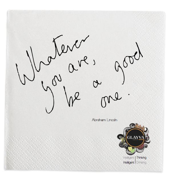


needed newest version of the logo an grey added to tag line. I think sleep deprivation was getting the better of me when I did the others yesterday evening....

Wednesday, 23 March 2011


matchbox
This is the finished mock up of the matchbox souvenir that I created a net for yesterday. Today Matt printed, crafted and photographed the packaging. These are the rough shots before editing :


I am going to use this photograph of a match to photoshop a full set into the images we now have.

final glass mock up (with napkin)

Following the crit feedback, we have decided to mock up the napkins on this photograph instead as I think that it looks better on the boards and the picture quality of the other napkin context shot was not as good as we had hoped.
....could do with brightening up a bit to allow the napkin to be more visible?


finished bar illustration

I have decided not to use the gold effect as Matt and myself have decided to include the photoshopped image of the two cocktail waitresses painted gold on this final board, so I think with this next to it, the concept will be clear enough.
I have also adjusted the drinks fountain so that it is straight, rather than slightly skew which was really annoying me and making it look less professional.
I am glad that I have done this hand drawn watercolor sketch rather than a vector drawing as I think that it helps to portray the aesthetic for Glayva that we have been trying to achieve and is perhaps a little more interesting visually than a simple linear structure. This was the opinion expressed during the final presentation so I feel like this decision is justified.
developments to bar illustration

I have drawn the bottles and glasses separately and then photoshopped them into the original to see how they would look...

I think that with the Glayva logos photoshopped in it looks really good and helps to emphasize the brand. I made the decision to hand draw the bottles rather than photoshop in actual images because I felt that there needed to be some continuity between the bottles and the rest of the illustration, as I definitely felt it necessary to use the actual logo and not hand render that.
cocktail waitress's tray with four different coloured drinks to represent the 4 suggested Glayva cocktails...

experimentation with gold foil

I have experimented with scanning in some gold foil to digitally collage onto my illustration. The reason I have not hand collaged this is that when laid flat on the scanner the foil scans as an almost black colour. I had to hold the foil about an inch above the scanner plate in order to allow it to appear gold. This is obviously not an ideal method of scanning. Unfortunately this has not turned out at all as I had wanted it to. I am going to try and download some free gold textures online and experiment with them instead.

experimentation with lighting effects in photoshop
I have been experimenting with lighting effects on photoshop using a tutorial I found online
(see context blog)


I think that the effect is pretty minimal in this case, as this area of the illustration is already fairly light compared to the rest of the composition. However I could intensify the effect a little and I still think it is an improvement on the original.
Tuesday, 22 March 2011


Monday, 21 March 2011

2/5 boards for presentation tuesday 22nd
I have been working on laying out the bar merch board and the bar interior board for tuesdays presentation along side Matt who has been preparing the other three.
design for bar merchandise board [1]

design for bar merchandise board [2]

design for bar merchandise board [3]
This is the one that I think works best in terms of layout. However, I think that not having a product shot of the matches will let us down so I am aiming to get one made up for the submission to accompany the design (centre bottom)

design for bar interior board
This is going to feature two designs for the sake of the presentation, however I will be perfecting one, more refined and professional version for the submission.

Subscribe to:
Posts (Atom)