I am now trying to create a scenario that allows me to design.... my focussed idea is the packaging and promotion of 'dumpster diving'. Ideas from brainstorming.....
>Map of best bins to dive around leeds?
>Target audience through 'Zine' type publications
>Underground scene
>Guerilla marketing
>Kit : gloves, head torch, bags etc
>Logo? Directional logos to navigate potential divers around the city to the best bins.
>Secretive promotion e.g. through comic strips, wanted posters, missing posters
>Event? Food/furniture etc provided from dumpster diving or other free sources
>Secret society
>Branding.... use the british terminology for dumpster diving, 'skipping', more intriguing and discreet
>Flyers.... gives me the opportunity to select my audience
>Event - invitations... allows me to select the kind of people I want to target
>Business cards? Discreet, target certain people.
Tuesday 26 October 2010
Thursday 21 October 2010
Type workshop 4
Attempt to make body of text as readable as possible, whilst fitting it all on one page.
The same task, but this time involving an image.
Attempt to make image as large as possible without loosing text readability.
Justifying the text so that it spreads to full width of columns.
Working with a 6 column page layout.
Final design : this was only a short exercise to try out page layout and experiment with adding a heading. I am pleased with my result, I like the transparency areas I added, which allow more of the image to be included. However, I think that the overall layout is very busy and not very appealing to read. It would benefit from more white space which I think would give the illusion of less information. I used a sans serif typeface for the heading and the first paragraph (in the grey box) because we learnt that serif fonts tend to be more legible for print based work, therefore using a contrasting font for the heading works well visually. If this were to be sent to print I would need to format the transparency etc in photoshop then link the separate file over otherwise it would not be able to print.
Wednesday 20 October 2010
Wrap it up evaluation
Following the crit, and generally in hindsight, I think that I could have considered a better stock for my nets, particularly in the case of the hexagonal one; which I had problems folding neatly. I also think that more information might have made the boxes more educational on my subject, however I did like the certain amount of intrigue that came with them. I could have made more use of half tones. This was something that I experimented with (see practice blog), however I didnt find the right way of using it. I think had I allowed or had more time, I could have come up with something more visually interesting.
Positive feedback from the crits included good use of strong colours, good use of the inside of the nets, and good modification of the nets in terms of the bite mark. I was really impressed with a lot of the work of other peoples in the crit today; however I felt that some of the visually more interesting ones had not stuck to the restrictions (two colours plus stock, one image etc). I think this made it hard to judge fairly which was the best.
Monday 18 October 2010
New rationale
I decided to re-write my rationale, as since last week I have slightly changed my concept. After researching into food waste in general in a lot of different areas, I have swayed back towards my initial 'good'; freeganism, and more specifically 'dumpster diving'.
Why?
1) Because tonnes and tonnes of perfectly edible food is thrown out each day
2) It is beneficial to the planet; this food would almost always otherwise end up in landfill sights.
3) It provides a free source of food for those willing to salvage it.
I intend to...
Direct and persuade people towards 'dumpster diving', an element of the freegan way of life .
My target audience is...
People who are part of a more underground culture. Predominantly students or people aged 16-25. Although through my research I have found that it is not just people who are skint that go for this way of life, I think that attracting new audiences would be easier if they had more motive to get involved. (i.e. students with very little money!) The reason I am not aiming my idea at a larger audience is that, quite simply, if everyone did this then it would not work!
I want to inform people that...
Freeganism is actually a very resourceful way of gathering food.
In order to achieve this I will produce...
a set of objects that are useful for the act of 'dumpster diving'. For example gloves, torches, bags, Tupperware containers. These would be used as promotional items. I am also interested in designing some kind of map or way of directing people to the best areas to go dumpster diving. Perhaps provide a stencil? I am also looking at ways of communicating to these underground cultures, e.g. fanzines etc.
These will be produced using....
Pad printing; for the 3d objects, lithographic printing for the other items like the fanzine or map. Also, I would perhaps have to use die-cut to mass produce stencils for spray painting logos or symbols to be distributed as a flyer type freebie.
final designs for net project
These are my final pieces for the net project:
I think they work well as a set, however separately they have some flaws. I think that the colour choices work well. The green is really juicy like a granny smith apple. I think simplifying my design was a really good descision. I was worried that it might not be clear that the packaging is supposed to give the impression of an apple, but I think it is very clear.
I think that this is the most successful, I think the shape of the box reflects the imagery of an apple really well. I chose not to fold one of the seams; at first by accident, but I actually think that the one curve completely softens the whole shape. I also really like the bite effect which was something I came up with only at the point of crafting. I think it really helps to convey the idea of it being an apple. My only reservations about this design are the positioning of the apple sticker, which in hindsight I think would be more successful if it were on the top as it would be more visible. I also think that the text on the inside of the box could have been a bit more considered. Perhaps I could have made use of the space
available more.
I really love the way that this net folds up. I think that the apple theme is successful, however I think in retrospect I could have taken more time to consider other possible ways that I could have made use of the two flaps.
I am the most disappointed with this one... I really thought that this one would work really well. Unfortunately the stock didn't fold as easily as I had found from my experiments. This particular net folds so many times, so it becomes increaseingly difficult to fold neatly. Also, my intention was that as it folded out a little bit of the inside of the apple would show each time, but this didn't work out quite right! Time permitting I will try and correct this error.
The thing I do like about this particualr net is how it looks when it folds out. The angles that it folds out visually look like sliced up apple pieces.
Saturday 16 October 2010
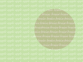
creating a bruise effect
I have been struggling the most with trying to create a bruised effect on the exterior of my packaging. I think if I was able to print to a commercial scale I would be very interested in experimenting with textured embossing or de-bossing, which would work well with the colour restrictions. I tried out some different ways of representing the bruised area.
I think that the message of the packaging is fairly clear without having the bruise effect. My original concept was that the bruised apple would appear completely edible once you open the mailshot/look inside the box. On further investigation and development of my designs, I actually feel that the words do a better of promoting my 'good', and in fact the only imagery I want to use is the apple pips on the inside and the tasty green exterior. I think this works well as though the tasty apple lures in the consumer, only to find out that it is promoting dumpster diving for your food.
inside of the nets
I decided to settle on a simple apple pip design that I created on illustrator with a simple message in the centre. The text inside is intended to be a response to the 'why freegan?' apple sticker which will appear on the outside of the packaging. I want my message to be simple, and not necessarily explain much about freeganism as a lifestyle, but more intrigue the viewer into fining out more about it. I did this by making my message cryptic but inspiring.
Friday 15 October 2010
Thursday 14 October 2010
photoshop apple skin experiments
To meet the two colour plus stock brief restrictions, I decided to experiment with duotones, something that we were shown in the first mac workshop this year.
I also experimented with the clone stamp tool on photoshop, which is something that I have never used before.
I found these effects more satisfactory than the watercolour starting points, but I still dont feel that it has the desired effect. I think this is mainly due to the colour restrictions. Time to rethink....
Subscribe to:
Posts (Atom)


