Sunday 22 November 2009

No News is Good News: Message and Delivery

I have finalised my design for the envelope; which is essentially all one net that folds up to form the entire mail shot, which the pack elements simply slot into. This will require the minimalamount of stock making it more economical and less paper is wasted. Also, I feel that the practical design of the envelope will help promote the message that sewing is 'practical' so that men will be more inclined to try it. The envelope will be sealed with a line of stitch, obviously emphasising the sewing theme, as well as making the envelope itself appear more visually intriguing; rather than simply coming across as a boring brown envelope.


After some experimentation with colour, I have chosen to go for a thick, fairly dark brown card for my choice of stock. The thickness is the best compromise in terms of being sturdy enough to support the kit, but not too thick so that it can comfortably be folded up. I think that the weight of the stock gives the mail shot a more sophisticated, expensive feel, making it appeal to the businessman character. I chose the brown colour because I felt it had an earthy hand-made quality to it, as well as having a definite masculine feel.


Wednesday 18 November 2009

No News is Good News: Message and Delivery


This is the design for instructions that are going to be included in the pack. They will fold down to a business card size, suitable to carry around in a wallet.
I am still not 100% decided on what stock I am going to use.


Envelope net for mail shot:


Friday 13 November 2009

no News is Good News: Message and Delivery


no News is Good News: Message and Delivery


No News is Good News: Message and Delivery

Following our first progress crit, I have decided to change the focus of my mail shot, and aim it at men, rather than women. I think that this will be a more interesting target audience to tackle. I have spent some time surveying my year group, finding that with only a couple of acceptions, none of the boys can sew. Interestingly, many of them expressed an interest in learning to, predominantly for the purpose of making their own repairs. I think that it's really interesting, especially in todays 'modern' society, that few men are handy with a needle. Especailly when you think that tailoring is traditionally a male proffesion. Following my research, I have in fact found that there is an increasing amount of blogs, websites and even sewing brands which are being aimed at mens crafts. For example Aisin, who have brought out a sewing machine soley for men. It's black, and extreemly masculine in design, resmbling more of a power tool than a sewing machine. I wan't my mail shot to engage the recipitant both visually and interactively.

My concept is essentially the same:

What? To promote sewing and persuade men to try it for themselves

Why? In the current economic climate, making do and menindg can save the individual money, and is also beneficial for the planet. To make men more self sufficient when it comes to repairs etc.

Who? Men in general, perhaps focus on students, or people away from home (and their mothers/wives/girlfriends! ) for example a business man on a trip.

How? By creating a stylsish, visually engaging, tactlie and interactive product. I think that men associate sewing as being a fairly efeminate past time for a man, perhaps because so many male fashion designers are such flamboyant characters, completely comfortable with their feminine side, which many men don't seem to be. I need to look at this challenge through the eyes of a man, which I think means it needs to promote sewing as something practical, and metrosexual.

After some experimentation with design and lay out, I came up with my initial solution. I like the idea of creating some kind of 'pack', so that there is the possibility with immediate interaction. I decided to get straight to the point, and offer some instructions for a practical task, and the impliments required to try it there and then. I thought about the best way to present the items, and came to the conclusion that the smaller, the better. The likeyhood of a man actually holding onto the products is greatly incresed if they would actually it inside his wallet.

Here is my intial desicn for this idea:

I want the instructions to fold down to the size of a business card:

As far as the envelope is concerned, I like the idea of encorporating the idea of recycling, by using a material such as an embroidery fabric to constrcuct it. This way the recipricant is actually provided with a piece of fabric with which to practice on. I also think that it will make the mail shot appear more intriguing and more tactile. I hope to either sew the adresses on by hand, or investigate the possibiltiy of getting hold of a sewing machine which can produce type. I am also considering experimenting with printing onto the fabric. The main problem I will have to consider, is how the envelope will hold it's structure, i.e. the contents will need to double up as the actuall backbone of the envelope. For this reason, I think that I will need to create some kind of sleeve to house the 'kit' that I am producing.


Tuesday 10 November 2009

No News is Good News: Message and Delivery Brief

In response to the poster designs, the next part of the brief is to create a mail shot that reinforces the message to an appropriate list of recipients.
Initially, I have been re-evaluating the way in which I put my message across.

WHAT is the message I'm trying to put across?
I am promoting needle crafts by trying to inform people of the rise in popularity of sewing and how it can help them.
I am also persuading them to try it.

WHY am I trying do do this?
In the current economic climate, the concept of 'Make Do and Mend' not only saves the individual money, but helps to reduce the carbon footprint of the planet by encouraging recycling.

WHO is my target audience?
My target audience is going to be primarily women in the younger generations, (possibly 16-35) who are less likely to know how to sew already. I think it will also mainly be aimed at women who fund their own purchases, and perhaps women who are more interested in fashion and the idea of customising their clothes.

HOW am I going to communicate my message?
I want the design of my mail shot to be tactile and possibly interactive, seeing as the message I am trying to get across is encouraging crafts and activity. I also like the idea that the envelope/contents tie in with the theme of sewing, making the subject of the message clear from first glance. I need to think about exactly what content I am going include verbally.
I like the tag line of 'Sew-it-Yourself', however I think that a little more well thought explanation into the concept will help with the delivery of the message.

We did an exercise where we wrote down 5 closed questions (blue), 5 facts (white), 5 open questions (orange), and 5 opinions (green). I found this particularly helpful in establishing the best way to promote my message.


Visual Language 10/11/09

This week we looked at Subjective colour. We looked primarily at colours in context: How colour really is relative, and how different contrasts of tone, hue, saturation, extension, temperature and complimentary colours can completely change the way that we perceive a colour.

Firstly we arranged all of our coloured objects in graduation of hue:
It was interesting to have this large physical image of all the different colours, actually seeing them side by side.
.


We then selected 5 of our orange objects, and also 5 of the blue objects from another group, so that we had the complimentary colour to work with as well.
We experimented with putting colour against colour, and seeing how they react against each other. These were the 10 most interesting of out experiments:

I think that the translucent nature of this blue object creates interesting shades within it, especially against the orange complimentary.

I think it's interesting how the bottom cap, although actually the same colour as the top one, stands out far more dramatically than the cap against the red and orange. We can conclude that this is because the bottom cap is a more saturated colour that the background colours, and the top cap is against a background very similar in both tone and hue.

In this image we arranged a blue and an orange object on a background which is there complimentary. In my opinion the orange object stands out more than the blue one; I think that this is due to the blue of the background being much duller and less saturated than the colour of the orange cap, creating a high contrast. The blue object is much more tonally similar to its background, preventing it from jumping out quite as much. If anything I think that the orange background is more saturated, drawing in the eye more than the object.

This example shows the way that the appearance of a colour is relative; while the orange stands out on the dusty blue background, it practically vanishes on the other side on the orange background. The same is true in reverse for the blue object.

This example helps to further illustrate the previous point; while the orange cap jumps out on the blue, it fades and looks almost red against the orange background, which is a more yellowy orange. See below example also:


In this image the blue savlon jumps out at the viewer because of the high contrast between the complimentaries, whereas the orange highlighter looks more red in hue and really doesn't stand out.

In these example we laid the paper out in a fan so that all the colours we had been using could be viewed. It allows us to see how the blue objects creates the most interesting shift with it's complimentary.


This final example also reflects the high contrast between the blue and the orange, while the other colours, particularly the colours closest to orange in the colour wheel don't create the same optical contrast.


Friday 6 November 2009

No News is Good News: Poster Brief

After experimenting with my initial ideas, I felt that the three designs were too complicated and didn't fit together in a series. Rather than creating three posters which reflect variations of the same design, I was on my way to creating three completely different posters. I was also struggling to maintain the restricting colour scheme of just two colours. I decided to just select one typeface and design a simple image that I could use throughout, almost like a logo.
I decided to use the font 'Home Sweet Home', as I felt it is more clearly recognisable as a stitched font and has better readability than the other font I was considering. Also, I like the way that from a distance, the systematic way in which the cross stitches form the letter forms almost looks digital, which I think works well with the concept: embroidery making a comeback in the 21st century.
However, I liked the more messy hand stitched quality of the other font, so I decided to use it as the inspiration for the heart design (see below). I think that a heart is an easily recognised symbol, and I think it is the simplest way of representing the idea that more and more people are finding this new-found ''love'' for sewing.

These are some of the designs that I came up with initially:


I like the layout of this design (below). I think what works best is the way is the small size of the font in contrast with the large image. I f anything I think that the image could be even larger. I also like the way that the message is along the bottom of the poster, which I think is a more subtle approach. I hope the effect will be that the image gets the viewers attention, then the words draw them in.


This is my design for the type based poster. After some experimentation, I felt that the poster actually worked better landscape rather than portrait. I think that this is due to the quantity and the length of the words.


In this design I experimented with having a little more information. I like the layout of the poster, however I think that the added information doesn't give the poster anymore information, and it actually gives it less visual impact. Perhaps if I were to choose some more interesting/relevant content it might make it worth having.


I think that this layout is quite successful. I particularly like the layout of the text in the bottom left corner. I also think that the large amount of space left open creates an interesting composition.


I think that the text element of this design works quite well; it really reminds me of the classic 'Home Sweet Home' embroidered image that is so iconic. However, I think that the text needs to be big in order to balance the composition, but I feel that the heart symbol doesn't work if its too small. Therefore I don't think that this creates the right visual impact that I'm looking for.


I decided to experiment with a heart made up of cross-stitch in a more embroidery based style. I thought that it might work better, as it would match the font. I actually decided that I preferred the more hand stitched appearance of the other heart.


I initially chose the colours green and pink/red because to me, they are quite nostalgic colours, for example in films and images when red and green filters are used. After printing out some of the designs in colour I actually decided that they lacked some of the impact that I was hoping for. I experimented with a few other colours and actually really liked this shade of dusty, but bright blue in contrast with the more vivid pink, making the image and type stand out more successfully. I also think that these colours would appeal to the target audience, which, without being hideously sexist, are most likely to be female.


Wednesday 4 November 2009

No News is Good News- Poster Designs

For the next part of this project we a have been asked to produce 3 poster designs; one entirely image, one entirely type, and the other a combination of the two. As I am looking at the revival of embroidery and other needlecrafts, I wanted to focus on getting this concept accross as a straightforward message i.e. 'Sewing is making a comeback'.
I want the message to be punchy, but also to leave an element of intrigue. I figure that the target audience for theses posters would generally be the younger generations, as older generations would be more familiar embroidery and other such crafts already. I wanted the posters to inspire the audience.
Some examples of the slogans I came up with initially include;
'Try your hand at something old', 'Sewing's in', 'Stitch yourself happy'. It wasn't until I was reflecting on my research when I was the expression 'S.I.Y' (Sew it yourself) in an article about the new found interest/need for recylcing and repairing in this recession. I liked the way that the writer was playing on the concept of D.I.Y, stereotypically a man's area, while 'S.I.Y', as it's now becoming known, I suppose, would stereotypically be imagined as a womans'.
I think that the slogan 'SEW IT YOURSELF' has the impact that I am looking for. It doesn't explain the facts and figures; how many sewing machines Tesco are selling per minute, but it's intriguing, and the message is clear. I imagine someone to see at as they walk by and perhaps think 'What's stopping me from getting out a needle and thread?'.

For the type based poster I have been looking at embroidery style fonts. The way that they are constructed is actually quite systematic in the way that the letters are formed out of cross stitches; as though you were working with embroidery fabric. I like the idea of building some geometric shapes behind the font in an effort to merge a futuristic, modern font with the old fashioned, comfortable embroidery font. I think that this will represent the modernisation of embroidery, and refresh peoples perspectives of it.

For the image based poster, I have really ben struggling in coming up with a high impact design without the aid of any wording whatsover. I though I would enjoy designing this one the most as my work is normally very illustrative and image orientated. I wanted to try and use symbolic items from needlecrafts; such as knitting needles, wool, thread etc. However, I was struggling in trying to put my message accross with the impact I desire. I thought about creating some illustrations, or photographs involving people to involve a character and make the image more personal. My favourite of these ideas is to have a stereotypical youth, perhaps slightly thuggish looking, but if you were to look more carefully at the image, see that he is in fact knitting. I like the way this idea defies all the sterotypes that most people would associate with knitting i.e. women in particular, and elderly people. My concerns are that putting a twist of humour wont actually aid the posters imapct in any way; the message isn't supposed to be a joke!

I've begun looking at examples of embroidery and pattern which I intend to try to manipulate to create something visually interesting. The colour restrictions might make this difficult, but I want to 'modernize' a piece of pretty dated, average looking embroidery by experimenting with composition and bright, eye catching colours.

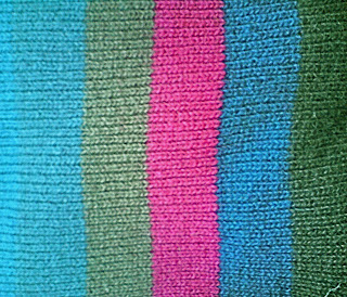
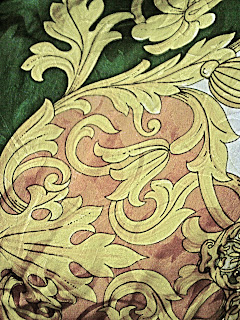
These are some examples of textured fabrics and patterns that I've been photographing:


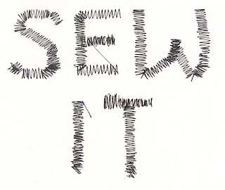
For the thrid design I am encororating fabric and stitch, perhaps in some kind of collage. I came across this font 'PT Sewed' which I love. It imitates a machine stitch, but I think whether you know that or not, it's a really decorative and interesting font:

I want to use this font, potentially hand drawn or actually stitched to give a feeling of something handmade, against a fabric or knitted background depending on what works best. I am also experimenting with buttons and other embroidery related items which I think would add to the composition.