Showing posts with label Image Module. Show all posts

Tuesday, 26 April 2011

End of module evaluation - Image

END OF MODULE SELF EVALUATION
BA (Hons.) GRAPHIC DESIGN
LEVEL 05 
Module Code :OUGD205
Module Title : Image

Throughout this module I think that I have developed a variety of new strengths and skills. The main transition for me was making a transition from illustration to image as a practice. Throughout first year I really struggled to apply my image driven practice to a graphic design context. I think that the image brief has allowed me to develop a better understanding of image in this kind of context. I have really enjoyed the briefs that were set, and found myself naturally moving away from my comfort zone of hand drawn illustration to try new techniques, processes and software in order to achieve interesting outcomes to the briefs. I think that this was down to the short length of each brief which gave me the confidence to try new things, because I new that if it were to not work, I would have the opportunity to redeem myself the next week, and have the time at the end of the module to make changes if I planned my time well enough. I also think that the short length of the briefs enormously aided my decision making process. I am terrible at making decisions on my own both on the course and in my day to day life, but the short nature of the briefs and the fact that they were run in conjunction with the other studio briefs absolutely forced me to work productively, plan my time effectively and make quick more instinctive decisions. The skills that I feel I have picked up in this module seem to have transfered naturally across to my other graphic design work, to the point that now I can see far more direction in my work and the way that I am using image within it. Another strength that I feel I have really developed this year is my blogging and recording which I now seem to do instinctively and I think really helps with my constant evaluation and decision making.
In terms of research, I have found in this module that due to the time restrictions it has been less pre-meditated and more a case of coming up with ideas and finding out the appropriate things as they come along. For example; software tutorials online, the lazer cutting induction I booked and experimentation into processes and materials.
I think that my weakest area of this module was the 2d/3d/2d brief. I am not very used to working in 3d and I don't think I was as creative as I could have been with it. I could have redone this brief for submission, however I wanted to do an image driven type based project as I really enjoyed that brief and as a result would really like to continue working with this kind of typography and in this direction in my final project this year. Another weak point for me was the final self-directed project. I was really pleased with the work I produced and I think I can see a clear improvement from the type as image brief we did previously in the module However, the fact that I had to go home and work for the entire Easter break really hindered what I was able to achieve for this brief. I am not making excuses, because I realize that this was my fault for not considering the implications of this beforehand. I knew I was going to be working and completely forgot that the final weekend of the Easter would be a bank holiday so the Uni not be open! I think I wasted a weeks worth of time coming up with all these ideas that I was not able to execute. However, I re-wrote my brief and I think I managed what time I did have effectively and the outcomes were still fairly successfull.

Three things that I will do differently next time : 
1) Consider time and resources available to me more thoroughly before beguining work on a brief.
2) Be more adventurous when working with 3d materials
3) Manage my time in a way that allows me more time to explore more work of other designers 

How I would grade myself on the following areas:
5= excellent, 4 = very good, 3 = good, 2 = average, 1 = poor

Attendance 5
Punctuality 5 
Motivation  5
Commitment  5
Quantity of work produced 4
Quality of work produced 3
Contribution to the group 3

All in all I can say that this has been by far my favorite module so far both in terms of the briefs but also in terms of the skills I have learnt and developed which I think will continue to transfer across to my studio briefs. I think that this module has helped me enormously to find my personal direction into graphic design.



Monday, 25 April 2011

final designs


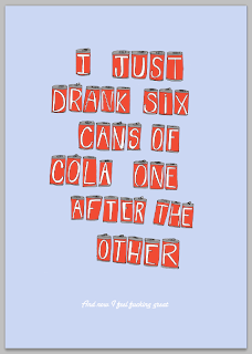
'cans' type experimentation

I have been experimenting with type for the second part of the quote and also background colour and positioning of the cans.


I straightened the cans a little as I felt that this might help to allow the two sections of text to run more fluidly together, because at the moment I think that they seem a little bit disjointed. 


I sourced some more script fonts and experimented with them :


I want to use a script font to contrast with the hand rendered feel of the can type and also to slightly reflect the Coca-Cola branded type. I think that this will help to subtly enforce the theme of cola cans.


I don't think that this hand rendered aesthetic works as the main quote is already hand rendered


I like this one best :


I don't like the upper case 'a' on the other fonts and I think that it needs to be stronger like this one as it is standing alone.

'shrimp' background and outline experimentation


I think that this darker version has a lot of impact, but I'm actually starting to warm to the previous design which at first I thought looked a little washed out, but now I quite like the subtlety. It suits the tone of voice and the colour palette.


I think that this lighter version looses too much readabilty/legibility

layout experimentation


'scenic route' type experimentation


I changed the positioning of the mask to reveal more of the forest and less of the mountains. I think the denser areas of line work better to make up the letter forms.

'shrimp' type experimentation

I have experimented with using another darker shade of grey in place of the black outline. I think that this works to some extent but it makes the whole thing lose impact and merge into the background making it look a bit flat.

'scenic route' type

I used this drawing as a base and then attempted to mask over this with text.

I found a tutorial which is posted on my context blog for how to create clipping masks.


I think that finding the correct typeface to work with will be extremely important. It needs to be fairly bulky to reveal as much of the image as possible.

Experimentation with typefaces :


I think that these two (below) work best. The lines work like blinds revealing the scenery behind. I am struggling to decide which works best. I think that this first one is more readable but I think that the aesthetic is more of an art deco cinema which is a little confusing for the intended subject matter.

I think now that I have adjusted the positioning of the mask this one works really well :


shrimp typeface

Originally I was going to work with this design in photoshop as I wanted to maintain the line quality, but after some experimentation with the trace settings in Illustrator I managed to get the desired effect eventually.


I then decided to work with the design in photoshop as I find the flexibility to which you can add colour and gradients better with this program.
I think that a limited colour palette would work best - just simple coral/pink - shrimp colours would help to convey the theme of the type. I actually think that simply changing the background works well to create the desired effect, however I want to explore all the possibilities before making any decisions. Unlike this brief before where I had to produce 3 ideas in just one week, I have more time to experiment before having to make decisions.


Removing the black creates an interesting cut-out effect which I really like, although some of the line quality is lost on the antenna of the shrimps. This is something that could easily be rectified should I choose this design.


I think this simple pink outline makes the design loose its impact. It starts to look like a faint pink drawing rather than a type face.

I am starting to experiment with gradients. I think that this is a simple way of adding tone to illustrate the idea of the curvature of the shrimp's exoskeleton without adding any extra lines or any colour. Considering the purpose and context of the design - ultimately to be read and understood - I think that the design shouldn't be over complicated anymore than it is. At the moment I think it has good readability as well as being clear that the letter forms are formed out of shrimp sections, but any more detail could make it too confusing.


I experimented with transforming the black outline into a gradient as well. I think that this slightly compromises readability, but creates a really attractive smooth, silky effect.


I experimented with using a coral colour against the pink colour across the gradient instead of the white which I think doesn't actually work as well as I thought it would. I think that the white creates the effect of a shine and reflects the translucent nature of a shrimps shell better.

Here is the effect of the gradient over all of the lettters :
I think that this works really well and a lot better than flat colour.


Removal of the outline create a really interesting effect :
It does lose readability but I think it has more visual impact. I thin that changing the background colour could improve this.


Experimentation with background colour :

I dont want to use too many colours, but I think that grey works really well with this particular shade of pink.


Removal of the outline in this case works a lot better. It is still slightly less readable than the one with the outline, but I think considering the scale in which I plan to produce this, I think that it may improve legibility and readability as it gets bigger.


Changing the outline to white really makes the type jump out and gives it more of a shiny luxurious feel. I'm not sure whether this suits the word and the theme but it could look really good for something more appropriate.