Monday 24 May 2010

INDESIGN_final layout


To be honest I really struggled with using indesign for this. It took me lot longer than I had expected to achieve something so simple, just to get it how I wanted it. I am pleased with the layout, I got there in the end. I think that the shapes work well to soften the feel of the spread. I wanted it to be simple and sophisticated which I think is where the black and white colour scheme works, while the pink and grey translucent bubbles make the piece more visually friendly. I wanted to use a simple, readable font so as not to overcomplicate the design of the spread. I think that the main image represents Maya well, it's natural and approachable. I allowed the text o run across both pages, a format that I have like in articles I have been looking at for this brief and the type and grid one. I think that the image could have ben manipulated more, or something could have been done to reduce the pixilation slightly. I feel that I have learnt a lot considering how little I knew, although I still feel lost with the program at the moment. I need to persevere and not shy away from using it, as I can see how useful it can potentially be. Unfortunately when printed the layout had some serious on screen differences, for example the image of Maya looks considerably darker allowing the outline of the photograph to be visible. I experimented with Photoshop trying to cut out just the outline of Maya and not the background but failed miserably and time ran out on me. This is something I definitely need to look into as I'm sure similar problems will arise in the future.

TYPE AND GRID_final image

This is my finished layout for the type and grid brief. I think it worked relatively well in terms of sticking to my grid and my design, although I did struggle with using the program. I am just getting used to working a bit more quickly on photoshop and illustrator, so found it confusing and a little frustrating at how long it took me to achieve so little visually. I found that working with a grid helped considerably to maintain a formulaic appearance to the layout which I think is far more visually appealing than not having any. I had issues with the pixillation of the image, I think I improved it slightly, although I think the main issue was that the image was from a magazine which is smaller than a4 to begin with. This is something I will consider more carefully next time I work with image on inDesign.


TYPE AND GRID_mock up for final piece

TYPE AND GRID_2 x larger mock ups


SPEAKING FROM EXPERIENCE_final pieces

Here are the final products for my project. I only made 6 models to represent what all 26 would look like as I didn't feel it was necessary to make the full set. This also allowed me more time to work on the best way of crafting them.
Front covers:

Inside linings:
Back covers:
I think that because they work so well as a set, it would work well if they were packaged or distributed together. Display and distribution is also an issue that came up in the final crit. Perhaps if they were displayed in a case where all 26 were all visible, and as you took one, it became replaced by another one behind it (like in a pile).


INDESIGN_ideas for layout

Mock up ideas for double page spread:

I have picked which image I like the best and that I want to use for the piece, i am now considering what I want to include for the second image. I want to keep the layout simple and sophisticated which reflects my impression of Maya and her style of design work. I experimented with incorporating some of Beatriz Milhazes' work (her favorite designer), but I found it looked overly fussy even when the colours were simplified right down to black and white. I like the layouts where the images and information are stretched along the bottom half of the page like a horizon line because the large area of space seems to draw the eye down to the information in a more focussed way, rather than having it all spread out, and a lot to take in.
I think that Maya's name is very visually interesting so I want to make this stand out. I think I will use colour sparingly to maintain the classy edge, perhaps just a bit of pink which is her favorite colour.


Sunday 23 May 2010

SPEAKING FROM EXPERIENCE_prototypes

After a series of issues in relation to printing, I decided to try to spray-mount two sheets of paper either side of a piece of card, feeling that this would achieve the correct thickness. I decided against the thin gloss paper available in the pc suite as I felt matt would actually look less tacky and I thought initially that this would not make it thick enough. I was wrong! once mounted together the card was an alright thickness, but once folded it caused all kinds of problems such as the papers sliding apart and thick heavy creases appearing along the folds.
I then decided to leave out the card and simply spray the two pieces of paper together, which worked really well. A certain amount of flexibility is needed in this packaging, and against my instinct the thinner stock worked really well. I was also unaware of how effective spray-mounting things together can be. I was making them simply as mock ups, but I actually felt that the quality was just as good. The thinner stock was also much easier to cut and manipulate, improving the quality of the final products considerably.


Thursday 20 May 2010

INDESIGN_body of text

From my interview with Maya I have come up with this body of text. I wanted to keep the tone light hearted and straight to the point, allowing the focus of the article to be on the layout to give myself the chance to experiment with inDesign. I researched into things that she had mentioned in order to create a more rounded and informative view of her interests.

MAYA SRIVASTAVA

Maya is currently studying Graphic Design at the Leeds College of art. Her favourite designer is Beatriz Milhazes, an artist who hails from Rio De Janeiro, Brazil. She is best known for her work reflecting Brazilian cultural imagery and references to western modernist painting. Her work is very decorative, image based, and stylish. Maya’s work is sleek with a professional style which is similar to Milhazes’.

Her birthday is July 23rd, making her star sign Cancer. Cancerians are known to have good instincts and look for security but also crave adventure. They are popular because they really listen to what others are saying. Home for Maya is Dubai. She is a sun worshipper and hates the cold. She loves and misses the beaches in Dubai. Maya has a lot of hobbies; she loves horse riding, golf and snowboarding to name a few.

Her favorite film is the much-loved comedy Anchorman. It is the fictional story of Ron Burgundy, the top-rated anchorman in San Diego in the '70s. When feminism marches into the newsroom in the form of ambitious newswoman Veronica Corningstone, Ron is willing to play along at first-as long as Veronica stays in her place, covering cat fashion shows, cooking, and other "female" interests. But when Veronica refuses to settle for being eye candy and steps behind the news desk, it's more than a battle between two perfectly coiffed anchor-persons.

Maya’s favorite book is ‘My Sisters Keeper’, the story of Kate, a girl who suffers from acute promyelocytic leukemia, a cancer of the blood and bone marrow. Anna, Kate’s younger sister was conceived in order to harvest blood from her umbilical cord in order to use in treatments to help save Kate's life; however, the treatment was unsuccessful, and ever since, Anna has been used as a donor for any other bodily substance needed to treat Kate, who continues to swing between remission and relapse as she grows up.

Her favorite colour is pink and her favorite food is chocolate.

SPEAKING FROM EXPERIENCE_website design

This is the first time I have mocked up website ideas like this. I mostly enjoyed experimenting with Illustrator some more. Once I worked through a few designs, I really started thinking about different ways of navigating around a website. I wanted to keep the way that it functioned and the design fairly simple. The idea is not complicated and its purpose is fairly novel as well as helpful.


I looked into putting the 'Leeds Sexual Health' logo onto my website to act as a link for more sexual health information, to further promote the condom element and to add another dimension to the site. In my final crit I think people thought it was a good idea.


Friday 14 May 2010

SPEAKING FROM EXPERIENCE_colour experiments

SPEAKING FROM EXPERIENCE_more drafts

3 more designs I've been working on today. Conceptually I think that is does work to a large extent. I think that the


Thursday 13 May 2010

SPEAKING FROM EXPERIENCE_first drafts

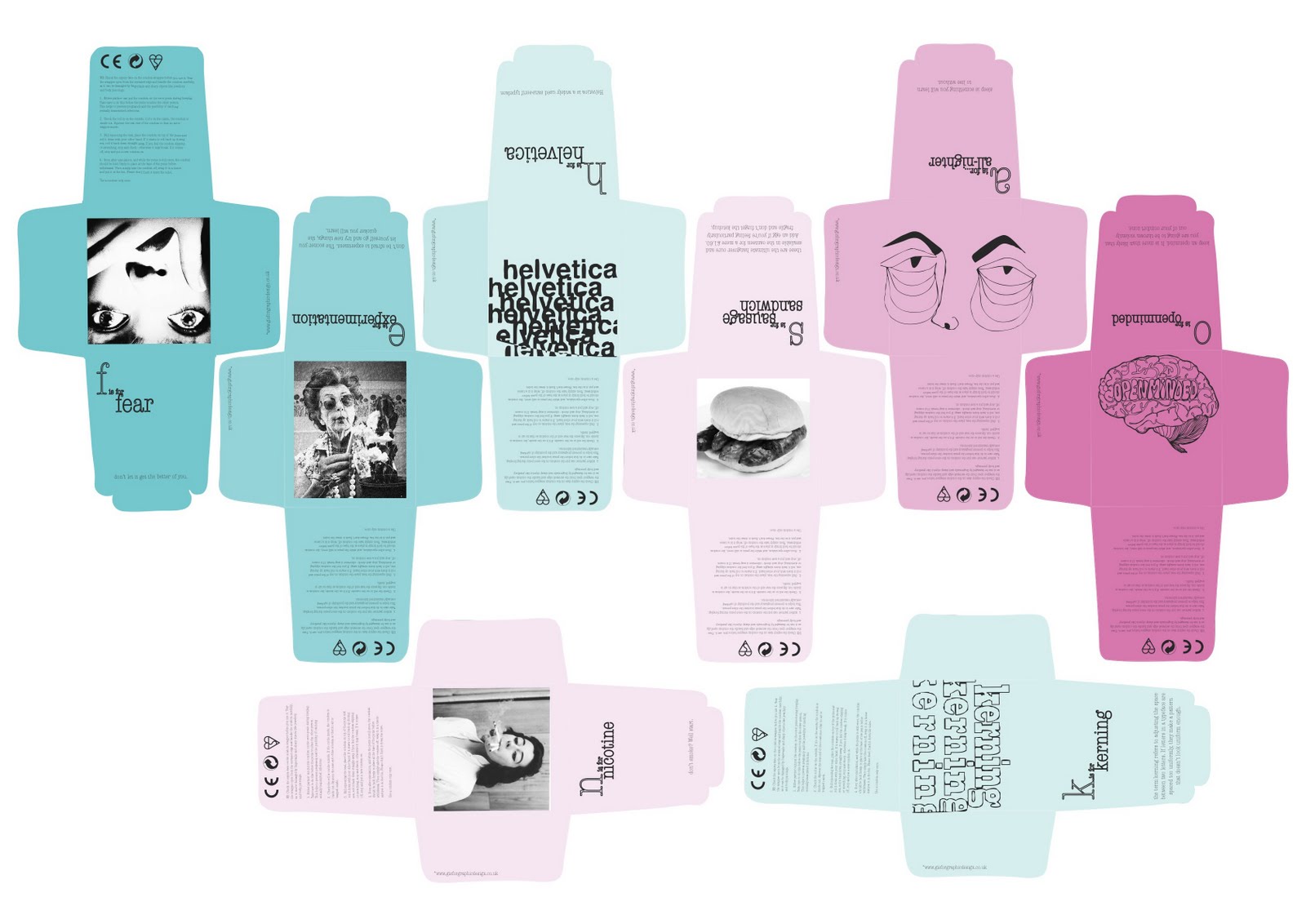
Today and yesterday I have been working on the first 14 designs for my product. These are only initial drafts of the main part of the design but I am fairly pleased with the outcome so far. It seems to be taking me longer than I thought it would, which could be to do with the fact that I am working so much with illustrator. On the flip side of this, I definitely am seeing improvements in my illustrator capabilities! Some are based on illustrations I came up with next week, while some are photographic images which are from my personal collection of found images, and some online where needed. I usually like using other peoples work in my own, but I felt some of the images suited the theme and the context so well, and had I tried to illustrate it myself, the comic value would have been lost. I am pleased with the type face I chose, although I think that the basic layout still needs some work. I'm finding it hard to visualize what they will look like without the correct stock;perhaps adding colour wil help me to get the layout right. For example; the designs that contain photographs don't look right in terms of composition. I think that this is because of the dark contrasts between the areas of black, particularly at the edges of the image against the white background. However, given a dark/coloured stock, this problem will hopefully be eliminated. The next step is to obviously finish the designs and experiment with what kind of stock I want to use. Then I can think about the possibility of a website when I've worked out the basic design/style/layout of the packaging. I would like to include a website in my final product to offer definitions of my alphabet and to try out something which I am not so familiar with. In the last project, when I worked with Alice, she handled the practical side of designing the website, while I handled the practical side of the t-shirt designs. I want to take on what I learnt from working with her on the website and try and design one on my own.

I really like this illustration and I think it works fairly well compositionally as well. I felt that it was necessary to have the work 'blog' included in the text, as the readability of the illustrated word is not perfectly clear, and I also think it helps to balance the composition. Also, the other designs include the word that is being illustrated so I felt it helped to maintain the consistency.


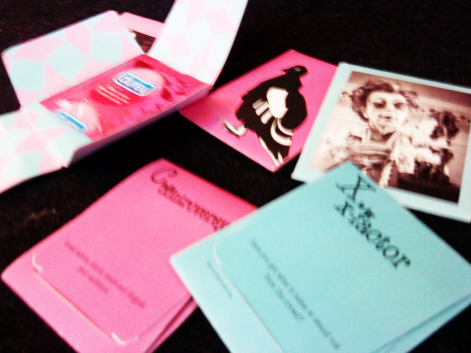
This image is from a postcard that I bought on a trip to Bristol a few weeks ago. I really like the blank expression on the woman's face as she lifts up her top. In the image it is clear that she is showing someone else, and that we, the viewer are not supposed to see her necessarily, but either way its something that is usually quite risque. I chose 'controversial' as a word because I think that thinking outside conventions and what is or isn't tasteful or acceptable is an important element of being any kind of designer.
I chose to just use text for this design because I really wanted to use this Fred quote and I felt with an image there would be too much information in such a small space. I tried to make the quote stand out by adding boxes.
This image is from the first scream movie. I like the composition and I think it depicts utter terror really well. I chose the word 'fear' because I feel that fear is an important part of the course whether it is supposed to be or not! I personally work best when slightly on edge, and I am definitely working out of fear a lot of the time. Don't get me wrong, I love the course. Obviously there is the fear of being kicked off the course, but what I mainly fear is letting myself down, producing work that I'm embarrassed by, or not meeting a deadline and looking like I don't care.