
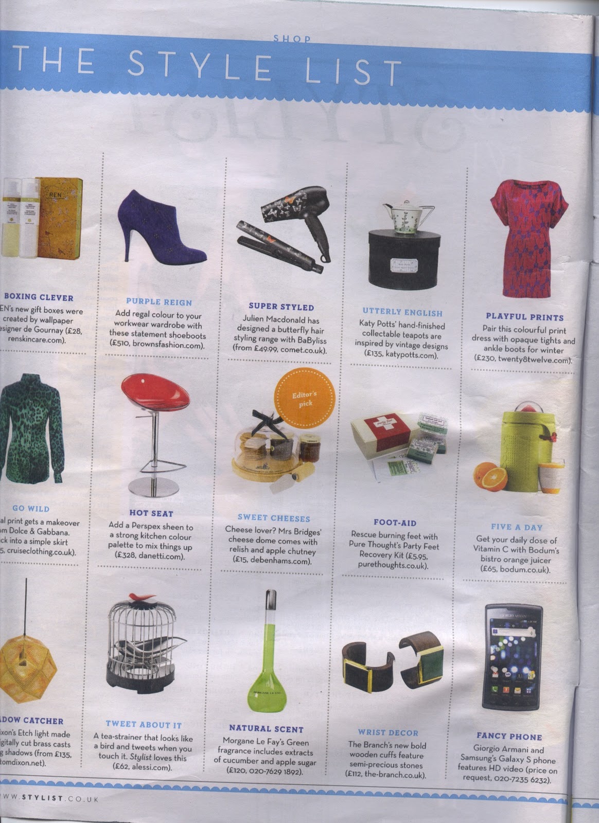
I wanted to try and contextualize my product and a one way of doing this would be to place it in the kind of situation where it would be viewed by the target audience. I thought of the kind of magazines that my target audience would read, and I think the perfect scenario would be the kind of magazines that are supplementary to a newspaper. A fashion magazine like Vogue or Elle might be too young or would only target a selection of my target audience, where as this kind of publication is the sort of thing that contains lots of gift ideas and various 'home-making' or luxury products. I chose to work with Stylist magazine which is a free magazine distributed widely, not simply because it's free (like the supplements) but because I love the layout and design of the magazine. Also, it does tick all the boxes in terms of content and target audience. Initially I simply photoshopped my product onto a scan of a double page spread:

I am pleased with the results of this experiment, although I think I need to design a layout for myself to make this idea more credible. Also I would like to print out my final design to make it seem more realistic.
I think that the type face they have used here and use throughout the publication is futura, which is a font that I have used for my product design already.


I wrote my own blurb for the product including a tag line to make it more realistic:


I photoshopped the 'editors choice' stamp onto my product to make it look more realistic and to attract the eye of the reader.

No comments:
Post a Comment