I want the design of the mail order poster tubes to reflect the theme of the relevant issue/poster. For example; if you were to receive your quarterly subscription of 'Mark My Words' magazine and it was the 'hair' themed edition, the packaging would reflect the contents of that issue. Likewise, if you were to order a poster online of one of the designs featured in the issue, the packaging that the poster arrives in would reflect the contents....
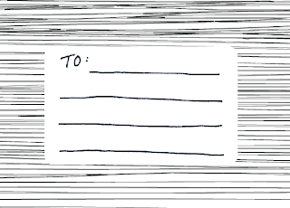
I have created a business card sized area for the address :
I'm not sure which direction of line will work best so I will print both to test on monday
I drew the address label by hand because I wanted it to have the same aesthetic as the publication and website. This also enabled me to easily work out a good size as I created it real size.
I was not sure whether curved or rounded edges would work best, but on further reflection I think that the sharper edges work best with the background.


No comments:
Post a Comment