

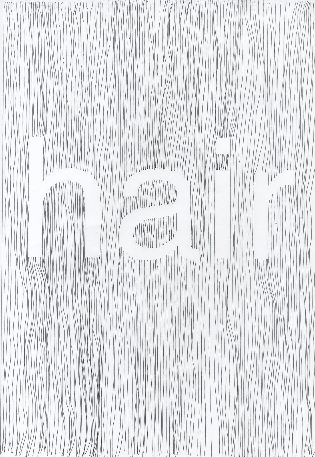
I have been working on a design for the cover of the 'hair' edition of the publication. I based it on helvetica because I feel it is nice and clean cut so the effect would created would still be readable. I am considering bulky newsprint stock for the pages of the publication, because it prints double sided whilst still maintaining the lo-fi aesthetic of normal newsprint (which I want). I think that I will use a thicker stock for the cover as the document will be A3 so I think it will need some stability in the cover. I am considering cartridge or watercolour paper as this is about the right thickness I am after.
Time permitting, which it is, I would like to screen print the cover. I think that as the publication is aimed primarily at graphic designers and typographers, they will appreciate the more hands on aesthetic of something printed by hand. This will also allow me to use brighter more exciting colours.
No comments:
Post a Comment