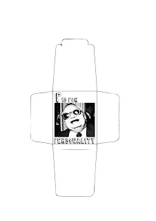
Today and yesterday I have been working on the first 14 designs for my product. These are only initial drafts of the main part of the design but I am fairly pleased with the outcome so far. It seems to be taking me longer than I thought it would, which could be to do with the fact that I am working so much with illustrator. On the flip side of this, I definitely am seeing improvements in my illustrator capabilities! Some are based on illustrations I came up with next week, while some are photographic images which are from my personal collection of found images, and some online where needed. I usually like using other peoples work in my own, but I felt some of the images suited the theme and the context so well, and had I tried to illustrate it myself, the comic value would have been lost. I am pleased with the type face I chose, although I think that the basic layout still needs some work. I'm finding it hard to visualize what they will look like without the correct stock;perhaps adding colour wil help me to get the layout right. For example; the designs that contain photographs don't look right in terms of composition. I think that this is because of the dark contrasts between the areas of black, particularly at the edges of the image against the white background. However, given a dark/coloured stock, this problem will hopefully be eliminated. The next step is to obviously finish the designs and experiment with what kind of stock I want to use. Then I can think about the possibility of a website when I've worked out the basic design/style/layout of the packaging. I would like to include a website in my final product to offer definitions of my alphabet and to try out something which I am not so familiar with. In the last project, when I worked with Alice, she handled the practical side of designing the website, while I handled the practical side of the t-shirt designs. I want to take on what I learnt from working with her on the website and try and design one on my own.
I really like this illustration and I think it works fairly well compositionally as well. I felt that it was necessary to have the work 'blog' included in the text, as the readability of the illustrated word is not perfectly clear, and I also think it helps to balance the composition. Also, the other designs include the word that is being illustrated so I felt it helped to maintain the consistency.

This image is from a postcard that I bought on a trip to Bristol a few weeks ago. I really like the blank expression on the woman's face as she lifts up her top. In the image it is clear that she is showing someone else, and that we, the viewer are not supposed to see her necessarily, but either way its something that is usually quite risque. I chose 'controversial' as a word because I think that thinking outside conventions and what is or isn't tasteful or acceptable is an important element of being any kind of designer.

I chose to just use text for this design because I really wanted to use this Fred quote and I felt with an image there would be too much information in such a small space. I tried to make the quote stand out by adding boxes.


This image is from the first scream movie. I like the composition and I think it depicts utter terror really well. I chose the word 'fear' because I feel that fear is an important part of the course whether it is supposed to be or not! I personally work best when slightly on edge, and I am definitely working out of fear a lot of the time. Don't get me wrong, I love the course. Obviously there is the fear of being kicked off the course, but what I mainly fear is letting myself down, producing work that I'm embarrassed by, or not meeting a deadline and looking like I don't care.


No comments:
Post a Comment