For the final crit Alice and I decided that I would heat press print the t-shirt designs, and she would set to work on the tags/buisness cards. I am really please with the outcomes of both. I think that the t-shirts would look more proffesional if I were to screen print them to avoid the white outline of the transfer. I think the chunky clothing tags work really well, and could be used as buisness cards as well.
Tuesday, 30 March 2010
Friday, 26 March 2010
Visual Language_WHAT IS A LINE? Development
I am still continuing to add to my sketchbook, so that I am constantly supplying myself with more material to work with and potentially develop. These are some ideas that I have developed from my original sketchbook drawings. I wanted to experiment with enlarging the images and adding elements of colour, other shapes and pattern:
I particularly like these two watercolour images, particularly once I had enhanced the colours and contrasts on the computer. The higher saturation was only possible on screen and I think it makes the images more striking, particularly against the large areas of bright white. I especially like the abstract quality of the paintings, I tried to only add detail in the form of pattern rather than facial characteristics. The fine lines and patterened elements remind me again of the contemporary illustrator Erone.
Thursday, 25 March 2010
Friday, 19 March 2010
Visual Language_WHAT IS A LINE? Michael Caine
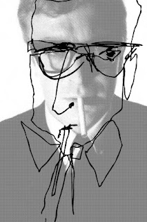
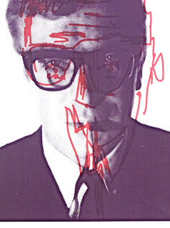
These drawings were all made from the same image of Michael Caine, which I think is pretty funny considering how different they are. This shows how differently one person can respond to one thing when using the blind drawing technique.
I experimented with the images on illustrator and photoshop; experimenting with half tones and the other functions we were taught in our print induction. I wanted to achieve the same look as the prints we made in the workshop when the photograph is divided up into lots of tiny circles, so that the lines would stand out over the photo.
My inital plan was for these to become the designs for a screen print, but I actually found that they didn't work as well as I had hoped. I'm not ruling out the idea, but back to the sketchbook for now.
Visual Language_WHAT IS A LINE? Illustrator experiments
First digital experiments for 'what is a line' brief. I have begun to experiment with a few of the drawings from my sketchbook. I now want to take them further and experiment with layering and incorporating other elements using photoshop/illustrator. This is partially because I want to try and use every opportunity to use these programs to try and get more confident with them, and also because I think that the resolutions could be quite interesting.
Alice et Polly - Communication is a Virus
Finished T-Shirt Designs:
These are the finished t-shirt designs. It has taken me quite a while to co-operate with illustrator, but I've got there eventually! As the colour palette is quite restricting, we have chosen to go with a more simplistic colour scheme, choosing only black, white and a red. We wanted to make the illustrations and captions the main focus of the product, using the red only where I felt was necessary to highlight elements of the illustrations. I think that the designs work best when they overlap the main proportions of the t-shirts slightly. The whole style is deliberately childish and scruffy.
As we bring the website and the t-shirt designs together we are now discussing the possibilities of printing a sample t-shirt and looking into designs for the clothing tags.
Thursday, 18 March 2010
Alice et Polly - Communication is a Virus
I think Alice and I work well together as we both share similar graphic design and thematic tastes and seem to both be pretty open to a range of ideas and comprimises. I like the fact that we are both not 100% confident with the digital side of things, as this way we are forced to both try somehting new rather than rely on one of us to handle the computer side.
After our first initial brainstorms together Alice and I have decided to investigate the statement"Tell a lie convincingly"......after our initial brainstorms we began looking into lies that parents tell their children, and vice versa, and eventually came up with the idea of printing funny lies that children have said onto childrenswear and accesories. We felt that this was a good market because of the fact that children constantly need new clothes as they are growing, marketing the theme of the t-shirts etc at adults would perhaps interest the parents more.
We both agreed that we wanted to use this collaborative project as a chance to try something new, and eventually decided that we would make a website for this project which is something neither of us have independantly tackled before. We are also talking about the idea of screen printing some of the designs eventually as well; a technique we are both keen to try. There will be a lot off illustration based work involved too which will keep us both happy.
For the first crit we brought a selection of our rough sketches for the designs and asked the members of our crit to simply tell us which worked best, among other things. We felt this was the easiest and fairest way to decide who's style would suit the concept best. We didn't let them know who's was who's it was just a completely subjective decision. We eventually decided that I would do the t-shirt designs and Alice would do the website (which is still going to be very illustrative). However, every important design decision so far has been discussed between the two of us to ensure that we are both happy...... so far, everything seems to be running extremely smoothly!
Monday, 15 March 2010
Visual Language_WHAT IS A LINE? Sketchbook Images
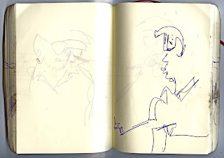
In this brief I am working with the statement "A mark indicating position, connection or boundaries." I chose to look specifically at the way in which we perceive, interpret and deliver lines. I have been building a collection of line drawings, day by day. I think that this could produce some interesting results, particularly when I take it hitch hiking across France and Spain to Morocco over Easter. Most of the drawings are blind drawings. I think that this will create more interesting results, really focussing on visual interpretation of the subject rather than thinking about composition of the line on the page.
These are some of the sketches I think work the most:
My fountain pen died on the train so I experimented with using just the cartridge and using the dried out nib of the pen to manipulate the ink slightly in areas to create detail.
The lines in this drawing are slightly more geometric which i think is interesting considering the way I was drawing previously. I like the way that the image fills the space.
I think that the scribbly lack of perfection in this image works well, and the facial proportions are fairly accurate in comparison to some of my previous drawings.
Monday, 8 March 2010
Don't Panic Live Brief
This is the design that I settled on following the crit feedback. My crit group felt that the original illustration with only slight photoshop enhancement was te most succesfull over the live trace and high contrast black and white image.The general concensus was that the caption was relevant, but the image was more striking and intriguing without the text. Besides, the Don't Panic submission suggests you add a title/explanation so I was able to submit the caption along side the image anyway. The descision behing this image came from my associations with the word 'Vogue', fashion being an almost inevitable response. I desided to put a humourous twist on a fashion illustration to kind of laugh in the face of ridiculous fashions. I came across an image on a fashion blog of a woman wearing a black hat with a faux lobster on it, which for some reason I found really funny and really liked. I wanted to use a limited colour palette, so that the orange stood out the most making it as clear as possible that the outfit is made out of lobsters, in case it wasn't clear initally.
Sunday, 7 March 2010
Book Fair Brief
I decided on a simplistic imagination based. ink and watercolour, drawing for my entry to the book fair, which I am crafting as a poster which folds out of a book. This decision was based n the money making element of the book fair; I felt it would be best to play to my strengths in order to have chance of making profit.
Each section of the poster will appear on each of the pages, leading the reader in gradually by only showing them a glimpse at a time before they can unfold the poster itself.
I have experimented with two different kinds of stock; both different thicknesses of bulky newsprint. I chose this stock because I like the colour and the way that the ink sits on it. The less bulky stock does the image, although the thicker one is slightly more sturdy and looks better while the book is folded up in its initial state. I am probably going to use the thinner stock purely to be more cost effective as there is so little in it.
I chose to vary the width of the line, particularly on the skirt to suggest movement. I think the areas where the lines are very close to each other work really work, creating areas of more density. I tried to convey the idea of the line 'travelling' using colour, so I added the red line which kind of filters through the smoke and trickles down the womans back. I especially like the break between the end of the cigarette and the first puff of smoke.
Friday, 5 March 2010
Book Fair Brief
These are some of my initial ideas; I want to focus on the way that I photographed line in the visual language sessions, particularly the images I took of plugs, in which I chose abstract viewpoints to take pictures from. I want to work with line in a hand-rendered approach, perhaps illustration. Line drawing would suit this idea, with as much attention to detail as possible; i.e. lots of lines running close together?
Subscribe to:
Posts (Atom)