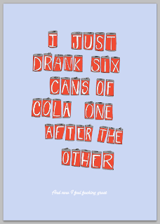
I have been experimenting with type for the second part of the quote and also background colour and positioning of the cans.
I straightened the cans a little as I felt that this might help to allow the two sections of text to run more fluidly together, because at the moment I think that they seem a little bit disjointed.
I sourced some more script fonts and experimented with them :
I want to use a script font to contrast with the hand rendered feel of the can type and also to slightly reflect the Coca-Cola branded type. I think that this will help to subtly enforce the theme of cola cans.
I don't think that this hand rendered aesthetic works as the main quote is already hand rendered
I like this one best :
I don't like the upper case 'a' on the other fonts and I think that it needs to be stronger like this one as it is standing alone.


No comments:
Post a Comment