Thursday, 28 April 2011

web design software workshop 1 - Thurs 28th April


SITE SETUP

Name site and link to route folder :
Link to server when site is ready :

Name server - computer that you are uploading it to...


DESIGNING FIRST PAGE

New page :

Save As immediately

Must save home page as "index"


route and image folders are available on right hand side :


Creating a box :


must add zero to indicate no value

design :

code :

press space after width, brings up drop down menu, press h to skip to height :

add value :


to select box in design mode, click outside of box and drag mouse across to box.
This selects the box.
to align centrally, go to align in properties bar and select 'centre'


To preview web page in browser :


To add colour click in box on design mode


chose colour from bg tab


changes to code :


preview on safari :

to add background colour add to code :

design view :

To divide box into two columns


(change colour to make sure you are using right cell)


put in 700 value for other cell - good design practice


split left hand column into 7


automatically equally spaced :


resize rows one by one (including final box - add value - good practice)


CREATING ROLL-OVER BUTTONS

(In Photoshop)
new web doc - transparent bg
add measurements of button....


add label for button


duplicate layer for roll over and change in some way e.g. colour


save for 'web and devices'


png good option
make sure transparency is checked
do this for both layers
(save to images folder in route folder)


back to dreamweaver insert>image objects>rollover image


fill in details and link to files


Tuesday, 26 April 2011

End of module evaluation - Image

END OF MODULE SELF EVALUATION
BA (Hons.) GRAPHIC DESIGN
LEVEL 05 
Module Code :OUGD205
Module Title : Image

Throughout this module I think that I have developed a variety of new strengths and skills. The main transition for me was making a transition from illustration to image as a practice. Throughout first year I really struggled to apply my image driven practice to a graphic design context. I think that the image brief has allowed me to develop a better understanding of image in this kind of context. I have really enjoyed the briefs that were set, and found myself naturally moving away from my comfort zone of hand drawn illustration to try new techniques, processes and software in order to achieve interesting outcomes to the briefs. I think that this was down to the short length of each brief which gave me the confidence to try new things, because I new that if it were to not work, I would have the opportunity to redeem myself the next week, and have the time at the end of the module to make changes if I planned my time well enough. I also think that the short length of the briefs enormously aided my decision making process. I am terrible at making decisions on my own both on the course and in my day to day life, but the short nature of the briefs and the fact that they were run in conjunction with the other studio briefs absolutely forced me to work productively, plan my time effectively and make quick more instinctive decisions. The skills that I feel I have picked up in this module seem to have transfered naturally across to my other graphic design work, to the point that now I can see far more direction in my work and the way that I am using image within it. Another strength that I feel I have really developed this year is my blogging and recording which I now seem to do instinctively and I think really helps with my constant evaluation and decision making.
In terms of research, I have found in this module that due to the time restrictions it has been less pre-meditated and more a case of coming up with ideas and finding out the appropriate things as they come along. For example; software tutorials online, the lazer cutting induction I booked and experimentation into processes and materials.
I think that my weakest area of this module was the 2d/3d/2d brief. I am not very used to working in 3d and I don't think I was as creative as I could have been with it. I could have redone this brief for submission, however I wanted to do an image driven type based project as I really enjoyed that brief and as a result would really like to continue working with this kind of typography and in this direction in my final project this year. Another weak point for me was the final self-directed project. I was really pleased with the work I produced and I think I can see a clear improvement from the type as image brief we did previously in the module However, the fact that I had to go home and work for the entire Easter break really hindered what I was able to achieve for this brief. I am not making excuses, because I realize that this was my fault for not considering the implications of this beforehand. I knew I was going to be working and completely forgot that the final weekend of the Easter would be a bank holiday so the Uni not be open! I think I wasted a weeks worth of time coming up with all these ideas that I was not able to execute. However, I re-wrote my brief and I think I managed what time I did have effectively and the outcomes were still fairly successfull.

Three things that I will do differently next time : 
1) Consider time and resources available to me more thoroughly before beguining work on a brief.
2) Be more adventurous when working with 3d materials
3) Manage my time in a way that allows me more time to explore more work of other designers 

How I would grade myself on the following areas:
5= excellent, 4 = very good, 3 = good, 2 = average, 1 = poor

Attendance 5
Punctuality 5 
Motivation  5
Commitment  5
Quantity of work produced 4
Quality of work produced 3
Contribution to the group 3

All in all I can say that this has been by far my favorite module so far both in terms of the briefs but also in terms of the skills I have learnt and developed which I think will continue to transfer across to my studio briefs. I think that this module has helped me enormously to find my personal direction into graphic design.


Monday, 25 April 2011

final designs


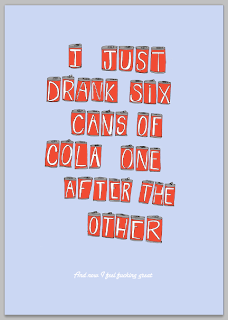
'cans' type experimentation

I have been experimenting with type for the second part of the quote and also background colour and positioning of the cans.


I straightened the cans a little as I felt that this might help to allow the two sections of text to run more fluidly together, because at the moment I think that they seem a little bit disjointed. 


I sourced some more script fonts and experimented with them :


I want to use a script font to contrast with the hand rendered feel of the can type and also to slightly reflect the Coca-Cola branded type. I think that this will help to subtly enforce the theme of cola cans.


I don't think that this hand rendered aesthetic works as the main quote is already hand rendered


I like this one best :


I don't like the upper case 'a' on the other fonts and I think that it needs to be stronger like this one as it is standing alone.