Tuesday, 27 October 2009

Visual Language 20/10/09

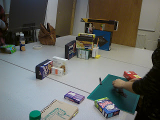
This week we used a variety of different sized boxes to create a letter. The idea was that the letter could only be seen clearly from a specific point, whilst looking through a view finder. I think ours worked reasonably well, as I think from this view it is clear what letter is being depicted. I think we could have thought more strategically about the colour range, for instance working more clearly from light in the foreground to dark at the back.


Sunday, 18 October 2009

Alphabet Soup

For the second part of this task we had to create a name badge for our partner which gave us the opportunity to experiment with the typeface we have designed as an actual word. Here I have experimented with different colour variations to see which works best. For the final name badge I will use just one colour combination for all the headphones. I didn't make many alterations to the actual letter forms, as I felt the readability was good, if anything the letters becoming more legible when presented as a word. I made more use of the headphone cable, using it to link each letter to the next which I think works well, making each letter form flow into the next.


Wednesday, 14 October 2009

Visual Language 13/10/09

This week we worked with the idea of communicating scale. We began by creating 5 different ways of representing scale, which we then swapped at random for another persons 5 representations. We then tried to improve the one we felt was the least successful, then created 3 of our own variations for each of the other four...


At the moment I am experimenting with colour. I think for this font, colour is going to be very important as far as getting across Jamie's bright and playful personality to an audience. I want use bright colours, but I am trying to be selective in the way that I use them so that the final outcome isn't too garish or tacky. I think the primary colours work well together and also help in communicating the 90's feel I want this font to have. I have found that by making the cable a darker, not black, but more muted grey colour, it allows the actual form of the letter to stand out and not be overshadowed by the headphones.


I looked into using the original Walkman font because I thought this would be appropriate, however the font itself didn't explain what I wanted to about Jamie's personality. Instead I chose the font 'Mamma Gamma'. I like the way that it's playful, approachable and fun without being too complicated; leaving me space to manipulate it.


Mamma Gamma font:

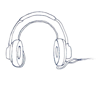
I particularly liked the letter 'g' in this font. It is an incredibly simple concept but I think it is really interesting. This was its circular shape that gave me the idea to experiment with headphones. I think as a symbol they work well to represent the musical element of Jamie's personality. I experimented drawing pairs of headphones mimicking the letter forms of the Mamma Gamma font.


I thought that this idea worked well but it needed some thought into how the actual letterform would be depicted to enable good legibility as well as clear readability. Although I found that this idea worked really well with some of the letters, some were not so easy to translate. I tried experimenting with different sizes and trying to incorporate other items such as an actual cassette player etc, but I personally found this made it too cluttered and it lost the simplicity which I liked about it.


In the end I found that the best way to overcome this issue was to use the cable as a way of actually marking out the letterform. I was still struggling with a few of the letters particularly 'i', and 'j', but found suggestions from the other people in my crit group very helpful. The idea of breaking the headphones apart had crossed my mind, but I hadn't thought it would work, so when it was suggested by someone else I tried it and actually thought it worked quite well!
Other suggestions that came up in the crit were the use of 'play', 'pause', 'stop' etc signs which I really liked and am experimenting with at the moment among other things like colour combinations. Below are some of my resolutions for the final piece.


Alphabet Soup Part Two

For this brief we were asked to design a full alphabet and glyphs to represent the personality/character of another person from our class selected at random.
My partner is Jamie... from just the first impression is personality comes across as playful, fun, entertaining, he dresses in bright colours, is a huge fan of novelty t-shirts and is very friendly. After asking him a series of questions about his personality, what stood out to me the most was his love of 'cheesy' music; particularly 90's sounds; being 25 he's a proper 90's kid! Also the fact that when asked what his most treasured possession would be, he said his ipod or itunes, deciding that he definitely couldn't live if he lost both! A lot of his answers were funny, he definitely has a sense of humour.

From the information I had, I decided that this font should not be to serious, if not with a novelty element. I wanted to capture his bright and playful personality as well as incorporate some of his personal tastes.

The four words I chose to base his alphabet on were; Cheesy, Loud, Bright and Novelty.
First off I looked into music that he likes and the kind of typography used for there merchandising, such as Beastie Boys, who have a very recognisable logo, and other brands; such as Adidas originals, which focuses on the 90's clothing style, and features bright 90's colours.


I liked the idea of using Jamie's passion for music, so maybe incorporating an image thats is iconically associated with listening to music. The obvious suggestion would be the ipod, however instead I started experimenting with cassettes and cassette players to symbolize the era of music he particularly likes. This idea came to me when he told me the first song he ever bought was 'Bad' by Michael Jackson on cassette!






Visual Language 06/10/09


This week we looked at visually communicating the words Dissect, Form, Compress, Hybrid and Edit, First through just one image, and then in four image sequences focusing on how a progression can communicate a word or idea.


Form.

Hybrid.
Edit.
Compress.
Dissect.


Hybrid in sequence. (top left to bottom right)


Dissect in sequence.


Duplicate in sequence.


Edit in sequence.


Compress in sequence.


Friday, 2 October 2009

Alphabet Soup- Final Product

These my final letters......
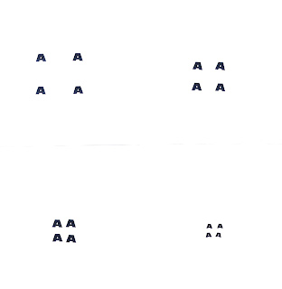
I chose these particular ten because they were the most simple in terms of the design, and I found the concept worked better with less complicated shapes. I think the A and the E work best, and the G was the lease succesfull. From experimenting on Illustrator, I found that I could in fact havemade one letter template and resized it to create the smaller letters. This would have made them identical in shape and form which I think would have worked better to get the concept of the design across more clearly.


Thursday, 1 October 2009

Alphabet Soup

This is our first individual brief since we have begun the course. I was given the word 'Duplicate' to visually communicate using 10 letter forms. My initial reaction was to look up the exact meaning of the word; Duplicate n. An identical copy, adj. Identically copied from an original.
I thought first words with similar meanings; alike, corresponding, matching. identical, 'ditto', equivalent, twofold, twin, copy, counterfeit. My first idea was to use the concept of a reflection. I used mirrors and took some photographs to try and communicate the concept of an exact copy; a reflection. This was not as successful as I'd hoped so I went back to the drawing board.


The expression 'Chip off the old block' came into my head. I really liked the imagery I was imagining as a duplicate physically being carved from the original. I did some sketches then chose a font called 'Letters 2' to base the letter shapes on. I chose it because I wanted something chunky and block-like. These are some of my preliminary designs.....


I began with pencil sketches which I then refined with fine black pen. I then filled them in on photoshop because I wanted a smooth flat finish to the coloured areas. I experimented with adobe illustrator for the first time, only getting as far as reworking the outlines. However, the result of this didn't necessarily improve the appearance dramatically, and I liked the hand drawn feel to the letters, making them a bit less serious and more friendly.

I think once I'm more accomplished at using illustrator, I will be able to work more with my drawings.