Monday, 14 December 2009

What if...

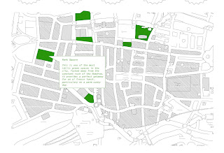
My initial list of free public spaces which I found over the weekend stretched all over the city centre, however, we discussed that we needed to focus on promoting the places in the very centre (i.e. LS1), which is where a vast amount of offices are. Therefore I continued to research finding even more locations, and also marking them out on a map. I also noted down opening hours and any other information that I felt was relevent for the website.
As well as this I did some research into contemporary lunchboxes to help us with our design. Whilst researching I came arcoss an article which used the expression 'thinking outside the box", which inspired me to come up with the name "Eat outside the box". I felt it was appropriate on more than one level; it fits the lunchbox theme, also as a metaphor for eating outside the office space, and on a simple level- thinking about things in a different way and perhaps being more adventurous. The group liked this idea, and a couple of us began working on a logo that we could use to help with the branding for the lunchbox and the site, so that they would be obviously linked.
We experimented with a few ideas, but it was proving more difficult than we though to come up with something everyone agreed on, that was appropriate for the campaign. In the end we decided considering the short length of the brief that it might be better to leave it for now and focus on the other more important elements.

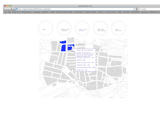
Arthur and Nick both came up with website designs, Nick working on the overal style and structure and Arthur more on the asthetic. In the end, after discussion we agreed on a compromise between the two, using the more formal and accessible layout of Nicks design, but using the map from arthurs. I marked on the locations and information about our chosen free spaces and wrote the blurb for the website, which was good because I felt I was able to make use of the research I had ben doing and be involved in the more creative side! There was no hard feelins in this respect, I think the best thing to do in this group work was to play to everyones skills, I just hope in the next one I will be able to adapt the project to my skills moreso than in this one!

Draft for website blurb:
Presentation plan:

Sunday, 13 December 2009

What if...

After another the weekend, we brought all our individual research together and tried to work on the problem. We had deliberated and come to the conclusion that perhaps the problem in fact not that there aren't enough free public spaces, but that people aren't aware of the free public spaces available to them. My research over the weekend was focussed mainly on this idea of locating all the free public spaces both indoors and out, as well as free lectures and free workshops that take place in the city centre. I though about who would benefit most from this information, and I felt that our target audience could in fact be office workers, as they are almost guarenteed to have an hour to half hour lunchbreak in their day, which is at their desposal. I found an interesting statistic; that in fact, assuming that you take your statutory holiday allowence each year, the average office worker spends 240 hours a year on lunchbreaks. The group liked this idea, and we decided that this would be our target audience, and this statitc would be our starting point for our new campaign.

We then discussed how we were going to promote this idea, and decided that as the locations and events may change continuously, we felt a website would be the most appropriate way of showing the information; as well as the fact that office workers tend to spend a lot of time online. I found from some of my research into online chat rooms, that it seems a large amount of office workers spend their lunch hour glued to their desk surfing the internet. After a lot more discussion and a minor breakdown, we finally came up with the idea of a free promotional lunch box. We had discussed that our target audience was going to be the office worker who makes their own lunch, as oppose to someone who can afford to dine out on a daily basis. Therefore we felt this idea was not only appealing but also useful; the best kind of freebie.

We then discussed some of the design asthetics and separated off into seperate smaller groups to make a start. We decided to try and make the best of the individual skills we had within the group initially.

Visual Language 08/12/09


What If...

Presentation

The presentation went reasonably well. I think it worked well using mainly imagery on our boards, but preparing notes on what we each would speak about. This meant the maximum amount of information could be given. What also worked well, was the way that we had considered what questions might be asked by our audience, which led us to be more prepared to offer solutions to potential problems with our idea. The general concensus was that our idea was perhaps a little too far fetched; in reality it would be difficult to get permission to use these spaces and there seemed to be all kinds of issues surrounding this. The feedback from the audience suggested that they felt the idea was strong, and that our point was justified. I think our research proves that there is a problem, we just needed to re-think our solutions.

Friday, 11 December 2009

Monday, 7 December 2009

What If...

Week Two

Following the presentation feedback that we received, and the research we had each done individually over the weekend; we had a lengthly brainstorming session, trying to re-think our problem. We needed to think of a more specific target audience, really indentify the problem, and come up with research ideas as to how to take this forward. We decided that perhaps what really needs to be done is promote whats already there; places which are free in Leeds city centre. We decided that we could promote the parks, as from our research we have found that there is very little advertising of these public spaces other than on maps of the city.
In my own research I had focused on the idea of 'Things to do with your lunch break/lunchtime". I found a variety of places which are free entry; for example galleries both large and small, churches, museums, libraries and other public buildings, as well as free lectures and workshops. I also found an interesting statistic that in fact assuming you take your statutory holiday allowance, the average working person spends 240 hours a year on their lunch break, which is 10 whole days! My group liked the idea of targeting the idea at people who want to do something in their lunch break that doesn't cost anything, but are uninformed of the possibilities. We also felt that this statistic would be useful if not essential in marketing our idea.
We felt the best way to promote these free public spaces and events would be through a website due to the constantly changing list, but in order to persuade people to take interest in what we are propsing, we discussed the idea of giving away something free with out branding and our message on it. We felt that the item should be functional, to echo our idea which is supposed to be useful, and not an advertising campaign. We discussed the idea of something like a pen, but we felt personally that pens were a fairly ineffective way of promoting something. I raised this issue after looking at my own pen and realising that it was a Leeds College of Art and Design pen (Which I had never noticed)! We though more along the lines of a 'lunchbreak' which led us to the idea of a promotional 'lunchbox', or more specifically 'sandwich box'.

Thursday, 3 December 2009

Photography Induction

I found the photography induction really interesting and extremely helpful, seeing as I had never used a digital SLR camera before. I am more accustomed to traditional photography; but even still my skills in terms of actually knowing what I'm doing are pretty experimental, rather than technical! At first I found it hard to get my hand round all the adjustments when using the camera manually, but I found this far more appealing than using the pre-fixed settings, at least at first. After persevering all afternoon, through trial and error, I think I began to get the hang of it.
These are some of the more interesting results from my experiments with my coloured object and different coloured cards:


I experimented with blue initially, as its the complimentary; I adjusted the colour settings on the camera to increase saturation, which I think creates really strong movement on the boarder of the two colours. I also experimented with coloured shadows and movement. I think that the most interesting images came from adjusting to a very slow shutter speed, and then moving different coloured card in front of the main image to create tints, without showing the pressence of the card.