Monday, 10 May 2010

SPEAKING FROM EXPERIENCE_second survey

This was just a quick survey for me to fond out of all the freebies that students received on freshers week, which was the most useful. I want my product to have a function, and the more useful it is, the more likely people are to notice my message.


Saturday, 8 May 2010

SPEAKING FROM EXPERIENCE_survey answers

THE BEST PIECE OF ADVICE YOU HAVE BEEN GIVEN THIS YEAR IN RELATION TO YEAR ONE GRAPHIC DESIGN?
e.g. Never work with somebody that you couldn't sue

Complete list of all responses given to this question
- SIMPLE AND EFFECTIVE
- dont stick to the first idea that comes into your head...at least not everytime
- Make your work easy and interesting.
- Work through problems, don't let them stop you doing anything
- learn from your mistakes
- make mistakes

THE BEST PIECE OF ADVICE OU COULD GIVE TO A NEW YEAR ONE GRAPHICS STUDENT

Complete list of all responses given to this question
- DON'T PLAN WHAT YOU CAN'T DO
- blog
- If you're not a Labour supporter and you're into politics, keep your mouth shut.
- Blog. Constantly.
- learn from your mistakes again
- use the first year to try out loads of new ideas and find what you want to do that way

10 WORDS WHICH SUMMERIZE YOUR FIRST YEAR OF THE COURSE

Complete list of all responses given to this question
- DIFFERENT
- scary.impossible.blog.fred.work.play.pain.constant.life.type!
- Progressively challenging yet very beneficial for development as a designer.
- Graphic Design- total overload, but in the best way possible.
- scary, nerve racking, emotional, fun, new, exciting, challenging, hardwork, cant think of any more sos
- intense busy poor digital ups downs

3 WORDS WHICH YOU FEEL SUMMERIZE GRAPHIC DESIGN

Complete list of all responses given to this question
- BROAD, EFFECTIVE, IMPACTFUL
- making the complicated simple
- Communication, Type and Image
- Really rather tiring!
- unpredictable, new, fun
- type and image

5 KEY WORDS THAT YOU FEEL ARE ESSENTIAL TO KNOW ON THE FIRST YEAR OF THIS COURSE:
e.g. Helvetica, kirning

Complete list of all responses given to this question
- WORK HARD WORK EVEN HARDER
- stock.cmyk.rgb.crits.originality
- Blogging, punctuality, deadlines, organisation and creativity
- It's kerning... Not kirning. Oh dear...!!

Concept, idea, blog, process, practice.
- type, image, time management, layout, punctual
- cmyk rgb si scott hahaha

Tuesday, 4 May 2010

TYPE AND GRID_grids


SPEAKING FROM EXPERIENCE_experimentation

I have been experimented with different styles of illustration. I think that using a combination of styles works well so long as the layout and typeface is consistent. As my message is fairly broad I think that I need to stick to strict design patterns.


Sunday, 2 May 2010

SPEAKING FROM EXPERIENCE_initial illustrations

Here are a few of my initial illustrations, I wanted to have a go at putting my ideas down in a more visual way. This has raised a lot of design questions: how will my product work? what will be its function if any? should the illustrations be consistent in style; .g. all hand drawn? A combination of styles?


Saturday, 1 May 2010

Sunday, 18 April 2010

Visual Language_WHAT IS A LINE? Experimentation with colour

I have experimented with adjusting colour. With this image I reduced the amount of colour to make it appear more earthy and natural.

I think this image works best when the colours are as bright and as saturated as possible, creating dramatic contrasts with the simple white background.

Saturday, 17 April 2010

Visual Language_WHAT IS A LINE? Development

In this painting I have tried to take on Steadman's style and encorporate it with my own natural stlye. I have tried to manipulate the lines in a way that makes them appear prickly and expressive. I also used indian ink to create large areas of solid colour so make the fine, spindelly lines contrast and stand out even more. I am pleased with the stylistic elements of the image, but instead of working blind, or from one of my original line drawings I worked from a magazine image. I think that the image looses the natural and abstracted quality that the other images have had.

Friday, 16 April 2010

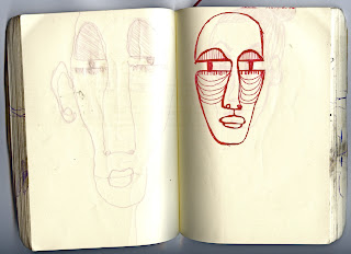
Visual Language_WHAT IS A LINE? Sketchbook Images Morrocco

Here are a few of the drawings I did on the hitch hike to Morrocco over Easter.
I like tribal influence in these images.


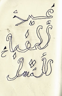
I met a Moroccan painter who wrote some arabic calligraphy in my book

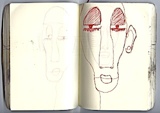
In spain on the way I met another painter in a bar. I asked him to draw in my book as well. He started by pouring his beer over the book, then when the pen wouldn't work he began drawing with cigarette ends. I think that that the results are pretty open to interpretation, particularly seeing as he couldn't speak a word of English, nor understand French. I am pretty certain that the second image is supposed to be a road, in reference to the hitch hiking? However I really like the practice; the idea of working with whatever materials are available to you at the time! Especially whilst traveling, I have encountered the issue of having to work with whatever implement you can find. I actually dropped my good pen in the middle of a duel carridgeway on the first day of the trip.


Friday, 2 April 2010

Visual Language_WHAT IS A LINE? Ralph Steadman experiment


I have been looking at the work of Ralph Steadman. I have always been a fan of his work. Not only do I love the scratchy, chaotic quality of his lines, but I especially love the way that he interprets and depicts what he's drawing. He tries to capture the atmosphere and the mood of the subject, rather than simply what it looks like. He uses expressive lines and marks which explain this. I also love the abstract faces of his charcters. This is my copy of one of his illustrations. I don't like copying other artists work, but I often find it helps me to understand the way that that artist has worked.