Wednesday, 12 May 2010

SPEAKING FROM EXPERIENCE_typeface experiments

I have been experimenting with some of the type faces that I found. What I have discovered is that most of them are too stylized, and in fact due to the variety of different illustration styles, a more simplistic type face works best. The one I have chosen is called 'tire shop'. I like it because although it is simple, it still has an illustrative feel to it because it is a hand drawn font and the shadowing allows it to stand out enough so that it doesn't become lost behind the illustrations.


Tuesday, 11 May 2010

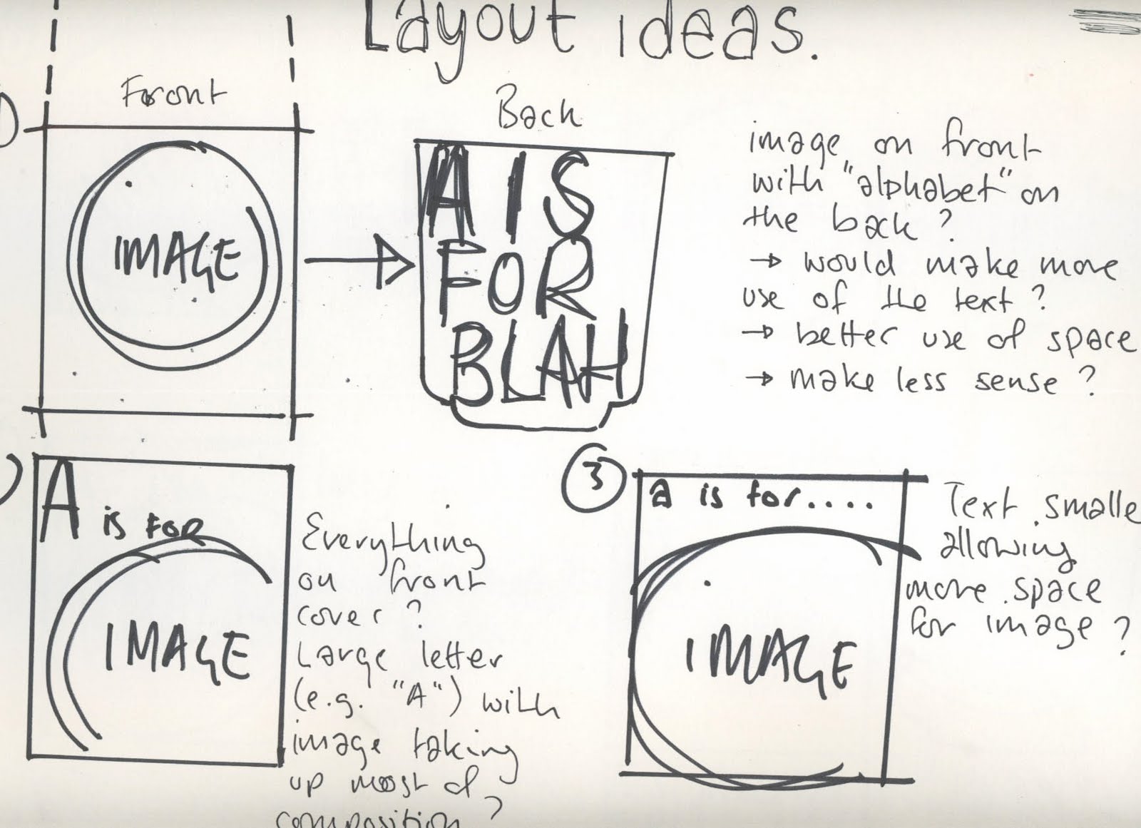
SPEAKING FROM EXPERIENCE_layout ideas


SPEAKING FROM EXPERIENCE_net for condom packaging

This is the net i found for a matchbook style card surround for a condom. The condom was given out for free at christmas time, each one hung individually on a christmas tree in a fashionable clothing shop. I like this method of distribution. Like with my project, the fact that the physical form of the product is a condom is irrelevant to the purpose of the product, simply using the fact that people are likely to take free condoms.


SPEAKING FROM EXPERIENCE_more illustrations


Stylistically these illustrations are slightly different from my initial ones for this project. I have been considering stock etc, and I am keen to try using a limited colour palette; for example coloured stock/background with black on top. I want the drawings to stand out and be interesting for their content and style alone rather than relying on colour. Due to the broad range of subject matter for the A to Z, I think keeping the colours simple would be the best way to make sure that they do appear as a set. I am happy to vary the colour from image to image, perhaps choosing 3 or 4 separate coloured stocks to work with. I like the style of these illustrations more than the previous. I have experimented with the weight of the line to emphasize outlines and lettering.

Monday, 10 May 2010

SPEAKING FROM EXPERIENCE_second survey

This was just a quick survey for me to fond out of all the freebies that students received on freshers week, which was the most useful. I want my product to have a function, and the more useful it is, the more likely people are to notice my message.


Saturday, 8 May 2010

SPEAKING FROM EXPERIENCE_survey answers

THE BEST PIECE OF ADVICE YOU HAVE BEEN GIVEN THIS YEAR IN RELATION TO YEAR ONE GRAPHIC DESIGN?
e.g. Never work with somebody that you couldn't sue

Complete list of all responses given to this question
- SIMPLE AND EFFECTIVE
- dont stick to the first idea that comes into your head...at least not everytime
- Make your work easy and interesting.
- Work through problems, don't let them stop you doing anything
- learn from your mistakes
- make mistakes

THE BEST PIECE OF ADVICE OU COULD GIVE TO A NEW YEAR ONE GRAPHICS STUDENT

Complete list of all responses given to this question
- DON'T PLAN WHAT YOU CAN'T DO
- blog
- If you're not a Labour supporter and you're into politics, keep your mouth shut.
- Blog. Constantly.
- learn from your mistakes again
- use the first year to try out loads of new ideas and find what you want to do that way

10 WORDS WHICH SUMMERIZE YOUR FIRST YEAR OF THE COURSE

Complete list of all responses given to this question
- DIFFERENT
- scary.impossible.blog.fred.work.play.pain.constant.life.type!
- Progressively challenging yet very beneficial for development as a designer.
- Graphic Design- total overload, but in the best way possible.
- scary, nerve racking, emotional, fun, new, exciting, challenging, hardwork, cant think of any more sos
- intense busy poor digital ups downs

3 WORDS WHICH YOU FEEL SUMMERIZE GRAPHIC DESIGN

Complete list of all responses given to this question
- BROAD, EFFECTIVE, IMPACTFUL
- making the complicated simple
- Communication, Type and Image
- Really rather tiring!
- unpredictable, new, fun
- type and image

5 KEY WORDS THAT YOU FEEL ARE ESSENTIAL TO KNOW ON THE FIRST YEAR OF THIS COURSE:
e.g. Helvetica, kirning

Complete list of all responses given to this question
- WORK HARD WORK EVEN HARDER
- stock.cmyk.rgb.crits.originality
- Blogging, punctuality, deadlines, organisation and creativity
- It's kerning... Not kirning. Oh dear...!!

Concept, idea, blog, process, practice.
- type, image, time management, layout, punctual
- cmyk rgb si scott hahaha

Tuesday, 4 May 2010

TYPE AND GRID_grids


SPEAKING FROM EXPERIENCE_experimentation

I have been experimented with different styles of illustration. I think that using a combination of styles works well so long as the layout and typeface is consistent. As my message is fairly broad I think that I need to stick to strict design patterns.


Sunday, 2 May 2010

SPEAKING FROM EXPERIENCE_initial illustrations

Here are a few of my initial illustrations, I wanted to have a go at putting my ideas down in a more visual way. This has raised a lot of design questions: how will my product work? what will be its function if any? should the illustrations be consistent in style; .g. all hand drawn? A combination of styles?


Saturday, 1 May 2010