

Showing posts with label Type as Image. Show all posts
Showing posts with label Type as Image. Show all posts
Monday, 31 January 2011

Thursday, 27 January 2011
Experimentation with creating a mask and adding plaster effect :

I was not content with the black layer behind the wallpaper. I thought it would look more affective than white or any other colour, but I actually think it looks like ink more than anything.... I learnt how to create a mask, and found this amazing website for free stock images of surfaces. I had considered plaster as a colour option to reinforce the impression of wallpaper, but I wasn't sure that simply the colour of plaster would be convincing, so this free plaster image presented a new option. I was amazed at how simple it is to create a mask and am really pleased with the effect.

Experiments with layout for a1 "balance":
I dont think it works centralized due to the triangular composition. I think there needs to be more weight towards the lower half of the a1...

I think that size is important in order for this to work, and I think scaling it up will make it even more illegible than it already is...

In terms of positioning, I think this is about right, but the scale too small.

I think that this is the one that I am going to go for...

Wednesday, 26 January 2011
"accidental tearing" developments
I hand crafted the torn lettering on a3 scale and then scanned it in whilst enlarging it to a1. I am pleased with the wallpaper effect, however the image is not as striking as I had hoped. I also think that it may look better with another colour behind it rather than black or grey... perhaps to give the impression of a wall; a previous paint colour or even another wallpaper....


experimentation with layout for "real life" a1

I like the scale of this one, but I think the positioning would work better if it was more central...

I think these letters look really interesting this larger size, but considering the large size of the paper, I think it may become a little overwhelming...

I think I will go for this one as it is still going to be large once printed, and the centralized text works better.

I am still torn a little between the two colour schemes.... I love the visual identity of the candy cane, however I also love the rainbow colour coordination of the other.
I also think that the pink backdrop (above) works really well.... I think I might have to print both and decide once I've seen them both. I'm gonna be skint, but I really like this poster so I just wont eat.

more variations on the word "balance"
I felt concerned about the readability of my other design so I decided to experiment with some type in a similar piled up compostiion to see if it had the same impact with better readbility.

I felt the first example didnt work so well because it needed some affect of leaning. I like the visual impact of the contrast between slanted and upright letterforms, however I think that the two different directions of slant don't work so well.

Here I have experimented with the basic outline of the letters once piled up in the card pile illustration. I think that it works as an interesting abstract image, however I think that the legibility is poorer than the card stack.

I'm really stuck on choices with this one, I think I might try get some peer feedback and then decide on one.
Tuesday, 25 January 2011
Variations on word 'balance'

I really like the concept behind this idea, however I think that the readability is poor.
In this development (below) I added these dotted lines to kind of fill in the structural gaps in the pyramid. I think that in some ways it helps the composition, but in others it takes attention away from the word, which is already difficult to see.

Here I have experimented with blocking out some areas of negative space to help me to define the letter forms. In some ways I think it helps, but I think it takes away some of the charm of the composition and the illustration.

For this idea, I have added an outline of the letters to help to define them. I think it helps but it has made the design even more complicated.

This variation I have experimented with different colours within the areas of negative space. I don't feel this works or makes much sense....

I think perhaps the addition of the letter outlines work, but maybe removing the dotted lines will give the composition the simplification it needs.


Wallpaper designs for Image brief...
Now I know that for this 'Type as Image' brief we were specifically told not to use or create image as an accompaniement, however for my A1 design for the quote "accidental tearing", I wanted to tear the words out of actual wallpaper and then scan in the hand crafted piece to reprint.... after some research into sourcing appropriate wallpaper, I go to thinking why dont I just design my own? I had a very vivid image in my head of what I wanted to achieve, so I saw no better solution than creating my own. Also, I am interested in pattern, and other than some independant experimentation with wrapping paper designs over the christmas break, I have not had the oppertunity to experiment with it...
I started by drawing my design by hand. I based it almost entirely on imagination for starters, obviously influenced by wallpapers that I have seen in the past, but the shapes were just drawn freehand as it was really just an experiment....

I vectorized the line drawing in illustrator and experimented with colour, as well as repeating and reflecting the pattern to build it up. I used guides and rulers to make sure the pattern was positioned as equally as possible...

I felt the pattern worked better in white :

gradually I repeated and arranged the pattern :


I created each row as a separate layer to make them easier to move about, the second half i was able to create as one single layer, although this made the program struggle and it became extremely slow to move. I am told now that there is in fact a function within the illustrator program that allows it to generate the pattern for you. I don't know whether this would be easier than what I did, but it's worth looking into.

I particularly like this pink colour as I like the subtlety of it....

Other colour experimentation :


This colour works well on the print outs :


I have chosen the more neutral blue and pink colours to print, as I feel that they wont distract from the words ripped out of them.
I have designed my wallpaper for an a1 scale, although I am printing out the piece to craft on a3 because this will be easier to manipulate by hand can be blown up to good quality a1 so long as I use the scanner in digital print.
Monday, 24 January 2011
"Real Life"
My first quote was taken from the Guardian article "Relationship Maths". My concept is based around the saying 'Life isn't all lollipops and candy canes'. I like the idea of creating a typeface that contradicts the subject of the text. I think that 'real life' is a phrase used more by children than adults, as it suggests an element of imagination going on in order to reflect back to reality. I want to embody this dreamlike quality in the type I create. I have taken my inspiration from other playful styles of typeface I have looked at as well as including things like candy canes, hearts and rainbows.
This is my first attempt which was just a rough sketch. I like the texture and detail built up by the close together lines, but I think it would work better if I had based it on an existing typeface to start with.
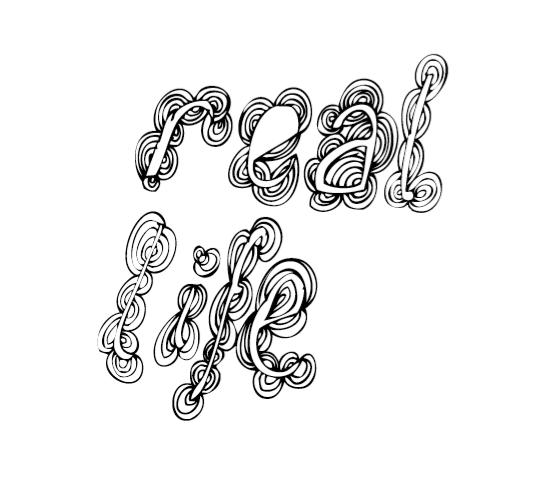
I decided to loosly base this design on the typeface 'Lobster' which I really love as an image based font. Here I have tried to create a fun, playful image based type... I wasn't happy with both of the 'E's...

I re-designed the 'E's, giving them a more regular pattern as I think it needed some systematic, more structured patterns to balance out the more irregular hand rendered style patterns....


This design was inspired by candy canes... I love it as a typeface on it's own, although it doesn't really work as it is in context with the brief....

I tried out this candy cane colour scheme... I was going to use red and white, but I think that will give the impression of a barbers shop!

I have also tried out a mulicolour rainbow style colour scheme.... Its hard to tell which works best without seeing the whole phrase like this...

Candy cane without black:

Multicoloured without black :

Full candy cane design :

With pale pink background :

Full rainbow design :

Rainbow design without black :

More muted colours :

Muted with grey replacing black.....

Subscribe to:
Posts (Atom)